—-
To stay in the loop with the latest features, news and interviews from the creative community around licensing, sign up to our weekly newsletter here

We caught up with Theresa to learn more about her history with brands, and what’s key to designing great product for Sesame Street.
As VP of Creative at Sesame Workshop, Theresa Fitzgerald is committed to ensuring that Sesame Street’s brand extensions remain true to the firm’s mission to help kids grow stronger, smarter and kinder.
With a range of exciting products and experiences thriving – spanning everything from socks to streetwear collections – we caught up with Theresa to learn more about her history with brands, and what’s key to designing for Sesame Street.
Theresa, it’s great to speak to you. A quick glance on your LinkedIn shows you’ve worked on some huge kids’ brands – SpongeBob, Rugrats, Peanuts and obviously Sesame Street. Was a career in the children’s space always on the cards?
It was! I always loved illustration and I thought I was going to be an illustrator. I grew up in a very creative family and we were always encouraged to draw and make things.
When I chose a college, I chose the Rochester Institute of Technology. It’s a very Bauhaus design school and back then there wasn’t much encouragement to illustrate if you were a designer – it was like ‘pick a lane!’ My aesthetic is very young and cheerful, and since leaving design school I’ve pretty much always worked as a designer – using characters and illustration as part of the design expression.
“The idea of what a successful product deal looks like to us has evolved as we’ve gotten better at it. It’s all about collaborating with partners that amplify the education angle and tell our mission story.”
Did you jump straight into work with brand owners?
No, my first job was with a kids’ clothing company called Healthtex. Then I went on to work at Scholastic as a book designer, but I did some freelance illustration while I was there.
Then I got a job with United Feature Syndicate, which was doing the licensing for Peanuts. I wasn’t sure about it initially, but I went on to have such a great job there. I would work directly with Peanuts creator Charles Shultz and review all of the product designs and look at how we would use his characters and comic strips on products. It was great, and my previous experience in clothing and books all came back into play when working with the Peanuts gang.
Sounds like fun! And from there, Nickelodeon beckoned?
Yes, I was launching on-air and off-air branding as well as doing product and packaging design for the likes of SpongeBob SquarePants and Dora the Explorer. I was there for the launch of both of those shows. It was a lot of fun and it was a really dynamic time for the company.
Then I saw the opening at Sesame Street and it seemed like a natural fit. It’s the gold standard of kids’ entertainment brands.
You’re VP of Creative at Sesame Workshop – what does that involve?
We work closely with the shows and we take their storytelling and do the creative across all other platforms. We do all the digital games, publishing and all the consumer products categories. We do partnerships, launch new seasons and social impact work – so all the design for the mission-based work we do to help vulnerable kids.
You mentioned working closely with the shows, so is that team interested in having a say in how the brand extends through consumer products?
Yes, we work really closely together, and I’d say we’re closer now than we’ve ever been. We work to integrate the stories being told and we do a lot of the visual design for the show, if they need a new logo or show packaging. It’s always with an eye on converting the work into assets for the apparel industry, as an example. We also support B2B activations like booths at trade shows and advertising.
Being close to the show in that way must help ensure your ranges are authentic and stay true to the core values of the brand. What else is key to translating Sesame Street into great products?
Sesame Workshop is an educational, non-profit organisation. Many people don’t know that. They get a sense that it has a halo around it and that we do good things, but it’s important to understand that we’re a mission-based organisation. Everything we do is to expand on that and help kids grow smarter, stronger and kinder.
The idea of what a successful product deal looks like to us has evolved as we’ve gotten better at it. It’s all about collaborating with partners that amplify the education angle and tell our mission story.
Does one partnership spring to mind as being a particularly good example of that?
For the 50th anniversary a few years back, we had a lot of partnerships where the manufacturer had their own social good footprint, so the collaborations elevated both brands. One of them was with Bombas socks.
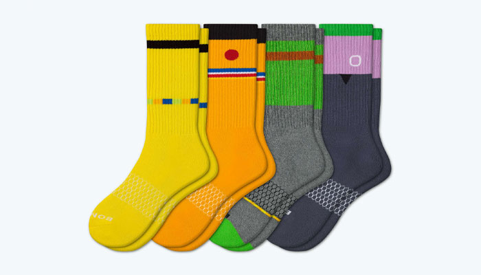
That’s a lovely range, with the graphic style recreating characters in smart, icon-driven way – Bert defined by the one eyebrow and the colours from his cardigan!
Yes, it really amplified our 50th anniversary style, and the design of the range felt both iconic and fresh. It spread our characters to adult fans and kids. Bombas’ social programme is to give socks to homeless people. So for every sock you’d buy, they’d give a pair to someone in need. It was a great partnership; our values were aligned and that’s a key means of how we measure success. We’re always looking for that in our partnerships.
It’s also one of the biggest changes to how branding in licensing has evolved since my Peanuts days. There would be art-slapping and you’d get a great t-shirt, and there is a value in that, but you wouldn’t get any enhanced messaging or brand value.
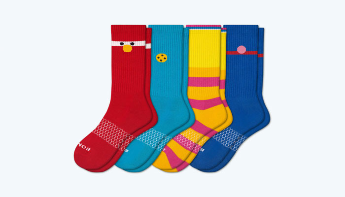
Absolutely; the Bombas deal seems a perfect fit, both in terms of the social good and also being a smart way of celebrating the characters.
Yes, and that’s the other thing we look for – partnerships that really amplify the characters. We have a neighbourhood full of characters and each one has a curriculum goal they were created to communicate.
Really! That’s fascinating – can you give us an example?
Well, believe it or not, Cookie Monster is actually teaching resilience and patience. Can you wait for that cookie? Each character has an emotional strength and curriculum that we use strategically depending on the product and the audience. For example, Oscar the Grouch is very popular with fans and older audiences, as well as kids. He has a way of communicating that Elmo would never embrace!
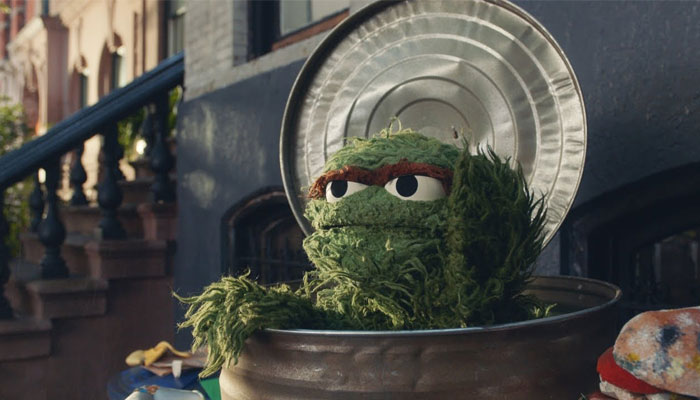
Now I’m hooked on these curriculums, what does Oscar the Grouch teach?
Honesty! He’ll tell you what he’s feeling and he’s not afraid to be direct… And that it’s ok to be the contrarian.
Useful lessons! The brand itself is iconic for its characters – and the street itself. Do you do much with the street when it comes to brand extensions?
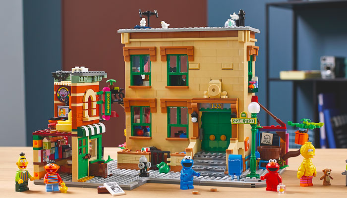
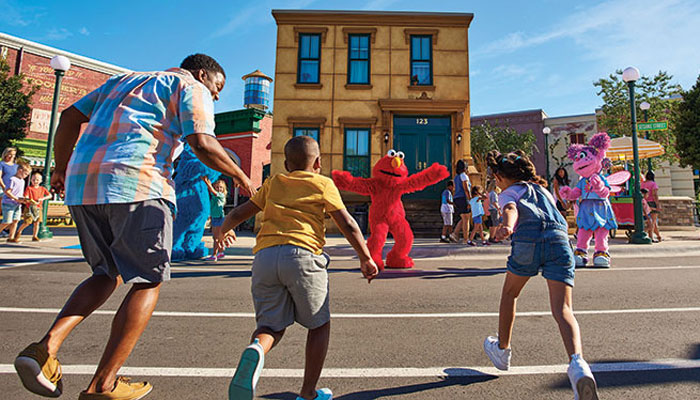
We have partnerships with theme parks. SeaWorld Orlando opened a Sesame Street Land in 2019. They replicated the street and so you can go there and feel what it’s like to be in the neighbourhood.
Looks fun! Sesame Street has been around for over 50 years; how has the brand’s relationship with consumer products evolved in that time?
The entertainment space is cluttered. There are many characters out there but few retail stores. It’s forced us to be smarter about who we partner with and how we connect products with our audience.
Nick Jr and Disney Junior have amazing content and there’s fierce competition, but as a non-profit, we don’t actively market our content. We cannot market consumer products. We don’t buy retail space or promote products through theme parks, so it’s forced us to be smarter about who we partner with, what we make and how its distributed. It’s a unique point of difference.
“Despite being over 50 years old, we don’t rest on being a ‘vintage’ brand. We can’t lean on the past. We have to keep reinventing because there’s always a new two-year-old.”
Is that true of the wider kids’ space? Do you have be creative with consumer products to stand out?
Absolutely, and despite being over 50 years old, we don’t rest on being a ‘vintage’ brand. We keep things fresh and new. We can’t lean on the past. We have to keep reinventing because there’s always a new two-year-old.
Looking at your recent collaboration with HYPE. Although there’s kids’ clothing in that collection, the design of that range has made Sesame Street look very at home in the adult apparel sector. How do you get that design balance right when creating adult products for Sesame Street?
When it comes to designing for toddlers, we know they love the characters and it’s simpler and more straightforward. With fans, we open it up wider. The characters are so iconic globally that we can simplify them. You could just see Cookie Monster’s eyes and know it’s Cookie. We can really boil them down to their essence. We also look at trends and the fashion world for inspiration.
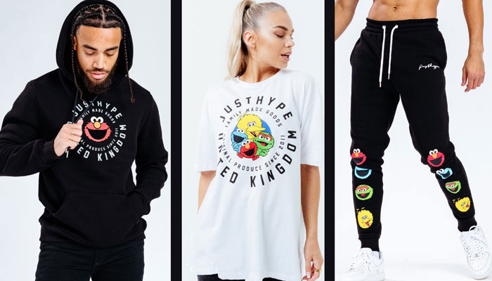
Do certain characters suit the adult market more than others?
Early on, Elmo wasn’t part of the core cast, so ages 35 and below tend to like Elmo. The ones that do very well with children in consumer products is Elmo, Cookie Monster and Abby Cadabby – she’s the newest big star we have. Audiences above that grew up with Grover, Big Bird and Bert & Ernie. They were popular then and they’re popular now. Across all age groups, Cookie Monster is number one.
Before I let you go, is there a recent range you think is a great example of a creative Sesame partnership?
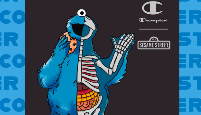
We did a deal with Champion for their new Blank Slate platform which saw us collaborate with artist Jason Freeny. It’s another way of making our characters feel fresh and innovative.
He does the anatomical character dissections, right? So you’d see inside of Cookie Monster for example?
Yes, and we have a lot of push and pull internally in terms of what is too far… Is this okay? Will this break the characters? It’s about getting that balance right between being cool and fashion-forward and being true to the characters.
Yes, I can imagine that’s a tricky balance to get right. I’ve already taken up too much of your time, so my last question is what do you do to fuel your creativity?
Well, I miss working at the office alongside illustrators and graphic designers and everyone else, because I think cross-pollination leads to inspiration. It’s a challenge, but I’m proud of how we’ve adapted.
I don’t see exhaustion in the work, and I don’t see a lack of inspiration, but this current way of working does interrupt the natural creativity that flows back at the office. That said, we’re lucky to have a great team that’s really kind and collaborative with each other.
Well, a huge thanks for making time for this Theresa, it’s been fun!
Theresa Main Photo Credit: Gil Vaknin.
Enter your details to receive Brands Untapped updates & news.