—-
To stay in the loop with the latest features, news and interviews from the creative community around licensing, sign up to our weekly newsletter here
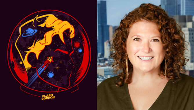
“These designs are unlike anything our partners have had access to before”: Beth Nock, Brand Marketing Director at King Features, on finding fresh looks for classic IP.
Beth, it’s great to chat. We’re here to explore King’s first-ever trend guides for The Phantom and Flash Gordon, created by the team, at XGuides – and they look great.
Thank you! A lot of creative and strategic thinking go into these guides and XGuides is an amazing agency to work with.
What for you makes a guide effective? What separates the good ones from the great ones?
I measure effectiveness by impact. Trends are fleeting and attention spans are short, so the creative must make a powerful and immediate impression that lasts. But great guides not only resonate… They inspire. They transform how our partners perceive our properties and open their minds to new creative opportunities.
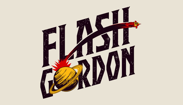
These guides are for brands that are almost a century old. How do you approach crafting creative for titles like this? Is there a balance to be struck between embracing newness while respecting heritage?
Evergreen properties like Popeye, Flash Gordon and The Phantom have achieved heritage status because their core attributes are strong and unwavering. They have inspired multitudes of cross-generational fans who feel personal connections to “their” brand or brands. So, my team must tread lightly in our attempts to keep the properties looking fresh.
Our goal is not to change a brand’s identity, but to visually retell the brand’s story in new and unique ways. When done well, the result is a powerful tool that can deepen existing brand connection and engage new fans.
“Great guides transform how our partners perceive our properties.”
Focusing on the Flash Gordon guide for a moment, what aspects of the brand did you want to shine here?
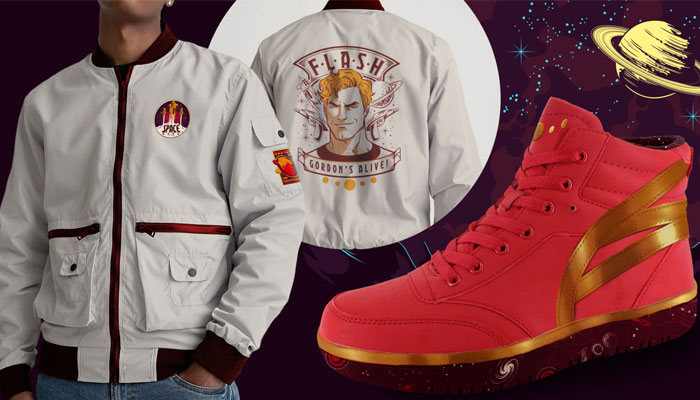
Flash Gordon is the world’s first intergalactic space hero, but his final frontier is the world of fashion! At 90 years, it was finally time for him to shine in this first-ever trend guide. Flash Gordon offers fans non-stop adventure. Now, with this guide, our partners have more opportunities than ever before to develop apparel and accessories programs that are out of this world.
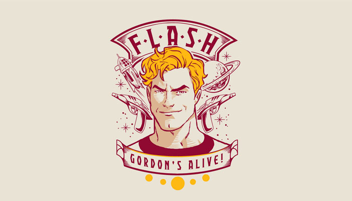
The graphic above manages to boil down the iconic elements of the character and brand into a very striking, but simple, piece of art. What are some of your highlights from this guide? And where do you see these graphics going product-wise?
I love that graphic as well! It’s very versatile – it pays homage to both the comic and the movie in a single badge, and the clean design makes it multipurpose. Other standouts for me include the graphic on page 14, the lettering on page 15, and patterns 2, 4 and 5.
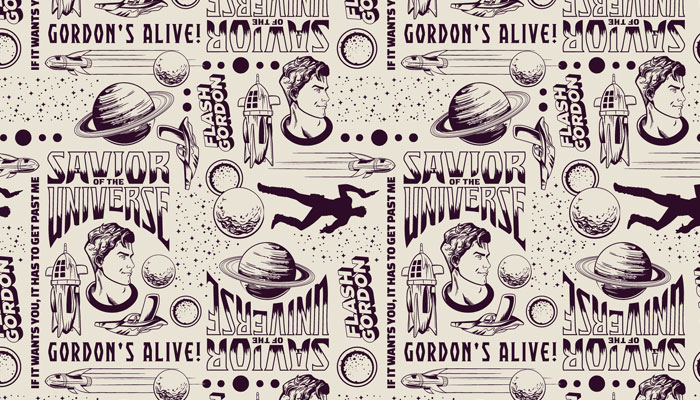
We’ll pepper those throughout the article! What do you feel these have the potential to do for partners?
These designs are unlike anything our Flash Gordon partners have had access to before, making development of deeper product lines and exploration of new categories now possible. Most of all, I’m dying for someone to create the high-top sneakers on page 22. Having that design in market would be my dream come true.
XGuides also created a striking guide for The Phantom. What are some key brand attributes you wanted to come through here?
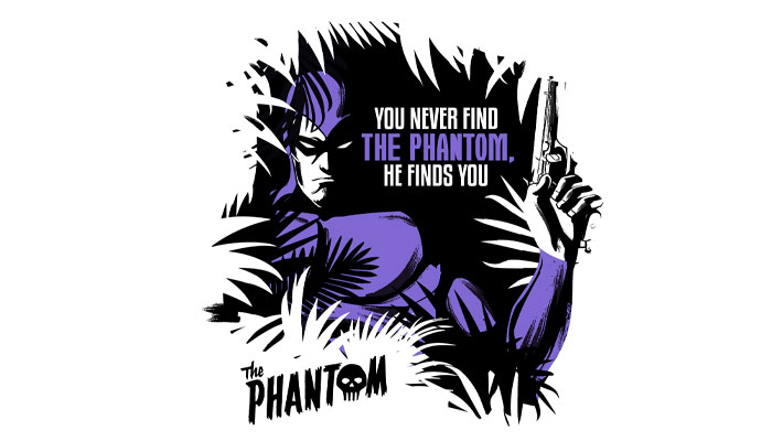
With the video game coming to consoles this December, I wanted to develop creative to complement the launch. The Phantom is a hero whose name drives fear into the hearts of even the most hardened criminals. I wanted to capture and transform that power into a guide showcasing The Phantom’s fierce sense of righteousness.
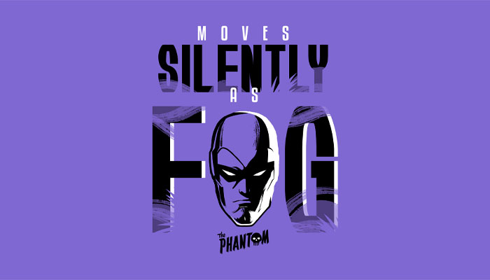
Referencing classic and modern comic stylings for inspiration, we combined a reduced colour palette, dramatic lighting and silhouettes with editorial from the comics – known as “old jungle sayings” to fans – resulting in a first-ever trend guide for The Phantom that is sure to make an impression.
Why do you feel The Phantom is an exciting prospect for designers at licensees to engage with?
Timing has never been better for creative partners looking to onboard a niche property with potential to becoming the next big thing in the market. The Phantom is on the rise with a video game, new publishing and new entertainment in development, plus opportunities for storytelling are endless.
Above all, The Phantom is dedicated to pursuing what is right and just. He is a beacon of light at time when our world feels consumed by corruption, dishonesty, violence, and chaos. And as a masked, multi-generational hero his adventures extend across time periods and locations. This guide is just the first step in helping partners bring that adventure to life in product form.
Fantastic. You also have a new trend guide for Popeye. I’m interested, with such an iconic brand – where so much has been done – how do you approach crafting trend guides for this IP?
You are correct! Popeye is a fashion icon who regularly collaborates with top designers around the globe, so identifying the next trend to target is a multi-step process for my team.
First, we look at what’s ahead for Popeye to uncover any partnerships that could benefit from additional creative assets. For example, as Popeye was becoming more established as a clean ocean advocate, we developed a nautical guide with clean seas messaging and graphics to assist our eco-friendly partners in the product development process. Then we encourage our international agents to share trend predictions and creative needs in their local territories, examine our asset library to uncover any white spaces and consult our own trend knowledge before briefing the creative agency and the real work begins.
In this case, XGuides then conducted a deep dive into upcoming trends that were relevant to the Popeye brand before presenting several inspirational concepts for our review. Only once we aligned on a direction, did we move on to development.
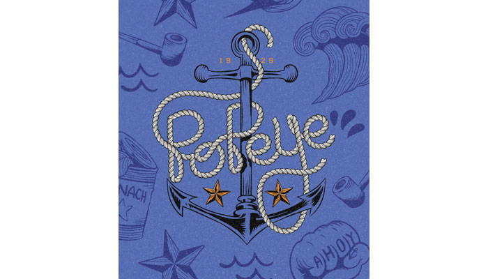
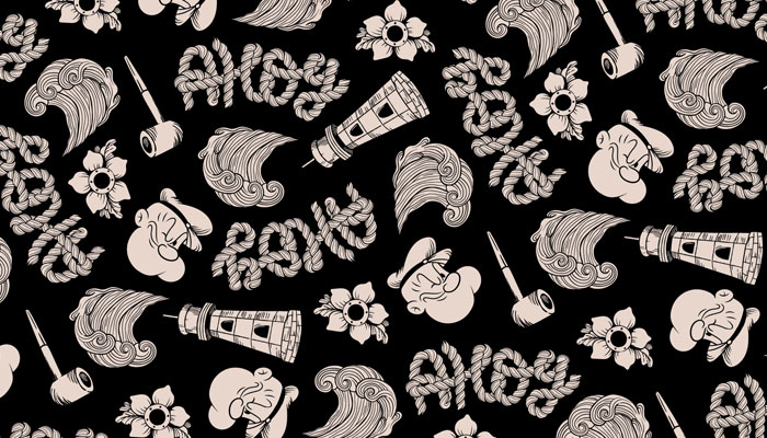
Some of these have a ‘nautical tattoo’ look, and the rope font is great. Is this about leaning into elements that are very Popeye, but maybe haven’t been ‘overused’?
I’m so glad you enjoy those details! They are both examples of what make this guide so unique. “Sink or Swim” was inspired by two starkly different styles – Varsity and Vintage Tattoos – artfully combined within a nautical theme to create an aesthetic that is uniquely Popeye… Part gentleman, part tough guy, part sporty and part sailor.
Four attributes I aspire towards! Beth, this has been fun. Before we wrap up, are there any pieces from the Popeye guide that you feel are particularly exciting from a design point of view?
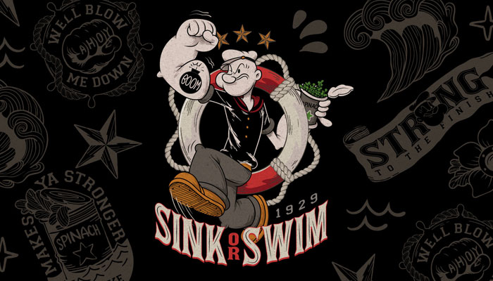
I find the graphic on page 12 particularly strong. It unites Popeye’s military roots with his no-nonsense attitude… There are no grey areas with Popeye — you either sink or you swim. I also enjoy that his physical strength is showcased while he is in action which gives the design energy.
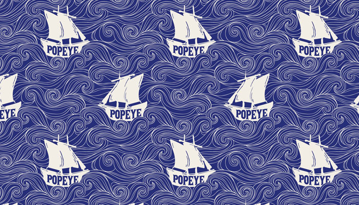
I love how patterns 2 and 3 are both bold and multifunctional, but in completely different ways. The first more is classically seafaring – I could see it lining a dinner jacket – while the second is more relaxed and fun… Better suited for an Aloha shirt!
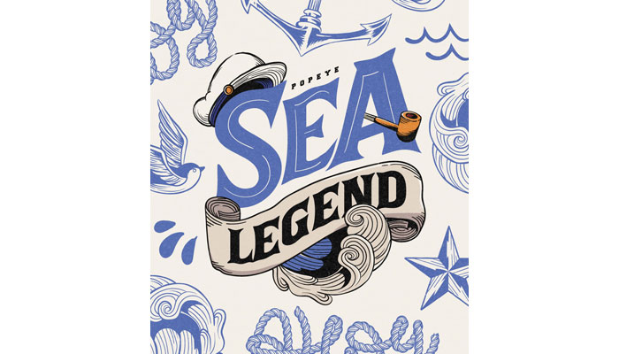
That said, the “Sea Legend” lettering on page 19 is the clear standout to me. It tells Popeye’s entire story in one very simple and stylish asset. The incorporation of icons instead of character art elevates the design and sets it apart from the typical branded badges you see in classic programs. Plus, the look is gruff, classy and nautical – the perfect combination of all three guide themes.
Overall, I think this is the most versatile guide we’ve delivered for Popeye – it has something for everyone.
Fantastic. I have one last question! How did you find your way into licensing? Was it always on the cards?
Like so many other people I know, I fell into licensing by chance. I moved to NYC from Cleveland, Ohio with aspirations to market independent film. In college I earned dual degrees – a B.S in Marketing and a B.A in Visual Communications Design – which gave me the flexibility to explore different roles over time.
After I began my career marketing and distributing feature films, I became a freelance photo editor with an amazing gig travelling around the country to high profile entertainment events, editing and captioning the photographs of celebrities, which eventually made their way into the media. When I was ready to return to a nine to five, I secured my first role in licensing – assisting the Head of Marketing at Classic Media, working on classic brands like Lassie, Rocky & Bullwinkle, Frosty the Snowman, Where’s Waldo? and Little Golden Books.
The company was eventually acquired by DreamWorks Animation. So, I returned to my roots, but on the consumer products licensing side as a Franchise Manager. Since discovering brand marketing was my niche, I have never looked back.
Thanks again Beth!
Enter your details to receive Brands Untapped updates & news.