—-
To stay in the loop with the latest features, news and interviews from the creative community around licensing, sign up to our weekly newsletter here
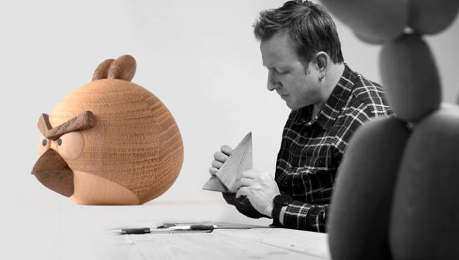
“For a character to resonate with us, it should have a timeless quality”: Jakob Burgsø, Founder and Designer at Boyhood, on the craft behind his collectibles.
For anyone new to Boyhood, how would you describe what you do and your approach to design?
Boyhood is a Danish design brand that specialises in crafting wooden collectible characters with a strong respect for Scandinavian craftsmanship and design traditions. Our approach is rooted in collaboration, particularly with our skilled partners in Vietnam who help bring our designs to life with precision and care.
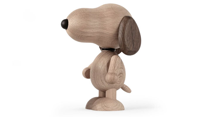
Growing up in Denmark, I was heavily influenced by iconic designers like Børge Mogensen and Kay Bojesen, whose minimalist yet functional designs have shaped my philosophy. We aim to infuse each character with our unique aesthetic, while maintaining the nostalgic essence of the original. For example in our Snoopy design, we chose to omit certain facial features like eyes and mouth to stay true to our minimalist style, allowing the form itself to convey emotion.
Was working with brands always part of the plan?
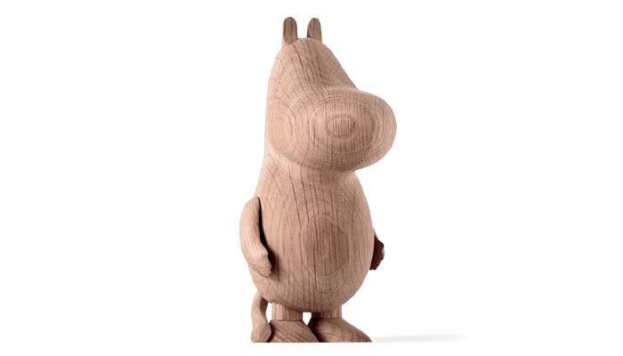
Yes, partnering with iconic brands became a natural progression for Boyhood as we grew. In the early days, I initially designed a wooden LEGO figurine, but I didn’t have enough experience with licensing at the time to secure a partnership… However, that didn’t stop me from continuing to explore new ideas and opportunities. Our first official licensing deal came with Moomin, a beloved character that fit perfectly with our vision of creating nostalgic, timeless pieces. This collaboration set the stage for many successful partnerships that followed.
What makes a brand attractive to you? What sorts of characters do well?
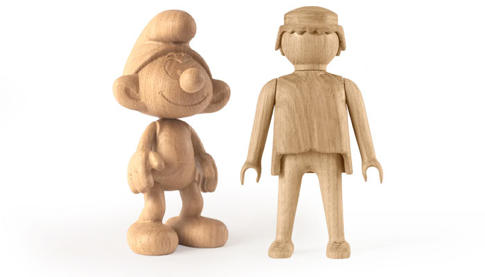
At Boyhood, we’ve always been drawn to brands with a rich history and characters that evoke a sense of nostalgia. For a character to resonate with us, it should have a timeless quality… Something that has touched generations and will continue to do so. Some of the characters that perform exceptionally well for us include Snoopy, Playmobil, Hello Kitty and Moomin. These characters have established themselves as global icons, and while Moomin has a particularly strong following in Scandinavia, the others enjoy widespread appeal worldwide. We’re also excited by newer characters that are rapidly gaining that same nostalgic status.
What kickstarts your process when it comes to design?
My design process often starts with inspiration from nostalgia and childhood memories. I begin by thinking about how a specific character or brand has influenced me personally, and how it can evoke similar emotions in others. From there, I sketch out initial ideas, always keeping in mind our minimalist aesthetic and the importance of staying true to the essence of the character. Collaborating with our skilled team in Vietnam, we then experiment with different forms, angles and materials to translate these ideas into wooden designs that feel timeless yet modern.
One of your recent ranges is Angry Birds! Why did this brand appeal?
Angry Birds was one of the very first mobile games that really took the world by storm – and personally, it’s one of the games that I was immediately addicted to when it came out. Its characters are simple yet incredibly expressive, which lends itself well to our design philosophy. The bold colours and distinct shapes of the birds make them instantly recognisable, which is important when creating iconic wooden collectibles. Plus, the playful, almost mischievous nature of the game fits well with our goal of designing pieces that spark joy and a sense of fun.
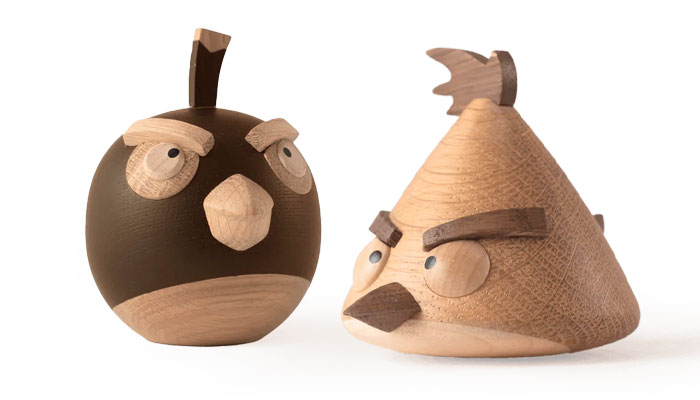
Were there any challenges about translating the Angry Birds characters into wooden collectibles? They seem quite ‘angular’!
Yes, translating characters like the Angry Birds into wooden collectibles definitely posed some challenges! The birds have very distinctive, angular shapes and sharp features – which are a bit tricky to replicate in wood without losing the character’s essence. We had to strike a balance between keeping those iconic shapes and softening them slightly to align with our more minimalist, clean-lined design approach.
The goal was to maintain the recognisability of the characters while ensuring they fit with Boyhood’s aesthetic, which emphasises simplicity and craftsmanship.
Well, I think mission accomplished! Thanks again Jakob.
Enter your details to receive Brands Untapped updates & news.