—-
To stay in the loop with the latest features, news and interviews from the creative community around licensing, sign up to our weekly newsletter here
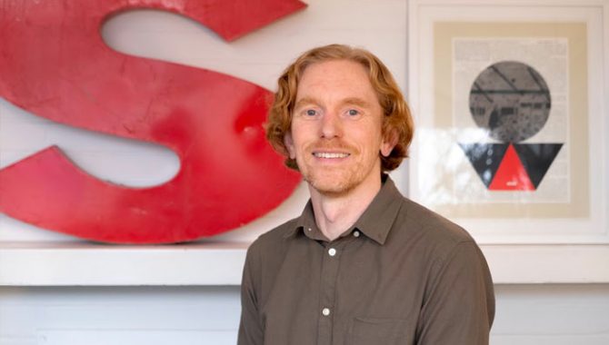
Steve McInerny – Director at Sharp Sharp Creative – discusses his process for getting under the skin of brands.
Hi Steve, thanks for making time. To kick us off, can you give us a little summary of your career and how Sharp Sharp operates in the design arena?
Hi Ian – and thank you for having me on Brands Untapped. I really like the emphasis you place on creativity within brand licensing.
For the past four years I’ve been running Sharp Sharp Creative, where we undertake a wide range of branding and creative projects. We work remotely, and have associates who specialise in brand strategy, copywriting and research who I can call upon when specialist expertise is required.
We have a focus on entertainment and brand licensing. Our clients include Warner Bros, Global Trademark Licensing and Yakka Dee! Ltd. This involves a mix of independent creative work as well as collaborating with associates on larger projects – I find that clients appreciate the flexibility.
I’ve been designing things for over 20 years now, mostly in London after moving down from North Yorkshire. Highlights of this time include working as a designer at the Natural History Museum, where I got to work with scientists and artists, with a special mention to the special effects team who were kept hidden away in the basement!
I also spent ten years at Fremantle, where I led a small – but award-winning – design and video editing team, this is where I first became involved with brand licensing. We got to work on an amazing range of brands, from Baywatch to Danger Mouse, and juggernauts like American Idol to experimental YouTube shows. It was a real privilege – despite feeling like a fish out of water – to occasionally go on set, and even on occasion to dress up in the characters’ costumes!
I’ve done my share of work on less glamorous brands, in less glamorous locations. If any readers are in this position, my advice is to keep plugging away and one day you’ll realise it was all useful experience, even if only to build character!
I know that you publish your own blog and in a recent post you made some very useful trend predictions for 2023. One area which you identified as appearing in a number of trend reports is AI, and in particular AI-generated imagery. Can you expand on this and why you see this area growing in licensing?
After struggling to find a comprehensive list of the trend reports in one place for this year, I decided to make one myself. I keep it updated here, so would love to hear from anyone who has any reports to share.
My predictions are just like anyone else’s – highly likely to be proven incorrect! One trend which I would feel comfortable about betting on the importance of is AI, and specifically AI-generated images, which are already being put to use by big brands and producers. It’s an exciting area, and is moving incredibly quickly, as technology develops and people find new and often unexpected uses for it.
This pace of change can be daunting, but I’d encourage anyone to have a go, whether you’re a creative person or not. Midjourney is a good piece of software to start with, and you can quite quickly generate some mind-bending images with only a few words as a prompt.
AI-generated imagery has already reached the level of sophistication where it is being used in real world projects. For example, high end fashion brand Moncler recently released a conceptual fashion campaign made using AI-generated images. More controversially, Netflix anime Dog and Boy features AI-generated backgrounds. This practise has generated complaints that artists’ livelihoods are threatened.
And you feel there are real-world uses for the licensing industry?
Yes, the possibilities for AI-generated imagery to benefit the licensing industry are wide-ranging. They include AI-generated product, retail and experiential concepts, social and even ad campaigns, as well as brand assets. And there is huge scope for brands to engage with their fans through collaborative AI-generated campaigns – in much the same way that TikTok has allowed music fans to incorporate their favourite songs into their own content.
There are risks and hurdles to overcome, so some caution is necessary. These include a lack of clarity around copyright, and a risk of fans getting ahead of brands with their own AI-generated collab concepts. This happened recently with the launch of the Nike x Tiffany & Co collab.
Have you been exploring the use of AI-generated imagery in your own work?
You bet! So far this has included a set of slightly satirical healthcare-themed toy concepts which were released at the start of Toy Fair. The high level of finish and often unexpected creations make AI images a great solution for product concepts.
They also make personalisation of images and text a possibility, which I made use of in last year’s Sharp Sharp Christmas e-cards. These featured AI-generated imagery plus personalised Christmas cracker-style jokes which I created using a ChatGPT-style AI.
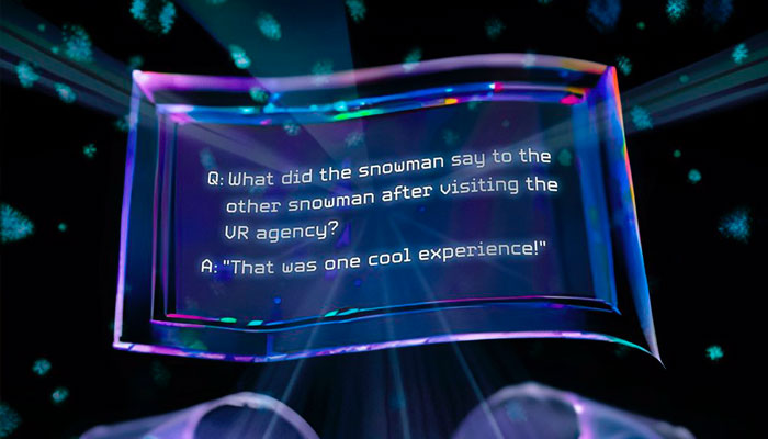
I’d love to hear from anyone who is interested in collaborating or commissioning work in this area, as the possibilities continue to unfold.
I noticed that you have done a lot of work for brand owners around exhibitions and designing trade show stands. What makes a good tradeshow stand do you think?
Stands which have a buzz and which delegates want to visit are not easy to achieve on a crowded tradeshow floor. A hook always helps, this could take the form of a central exhibit, a celebrity event or even some food and drink. Innovative video content can provide a strong hook, as the technology is developing so fast… Look up augmented reality, holographic projections and naked-eye 3D LED displays for starters!
The Moomins stand at BLE comes to mind as a strong example of immersing visitors in the brand.
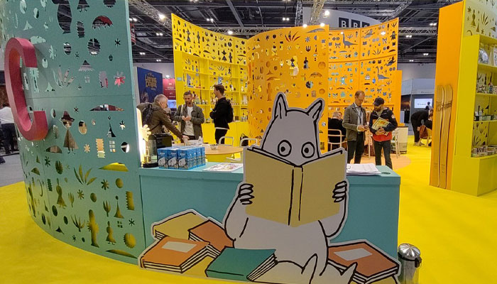
When it comes to the graphics – my speciality – I try to achieve impact and clarity when the stand is viewed from a distance, as well as design elements or physical objects – such as products – which engage people who are close to or on the stand.
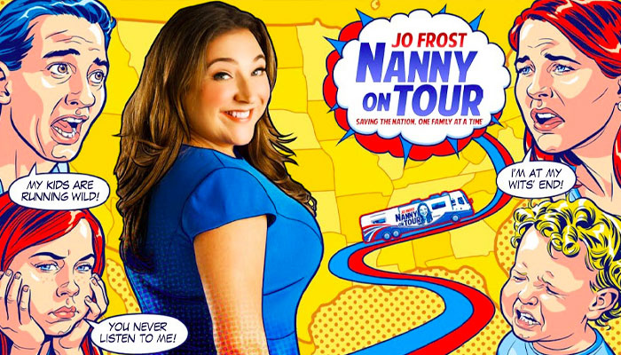
You mentioned celebrities being a potential hook, and you’ve worked with media personality Jo Frost – aka Super Nanny. What are the challenges you face when working with a ‘real person’ in regards to design and brand development?
I’ve worked on licensing and marketing projects for a number of personality-based brands and shows, ranging from Jamie Oliver and Nigella Lawson to Supernanny Jo Frost and the Keith Lemon-led Celebrity Juice.
The creative challenges in working with a real person could include them not being supportive of your campaign, product or design. Of course – naming no names! – there is always a reputational risk if the person does something which goes against the values of your business.
While legal agreements have their part to play, I believe that bringing the person with you in the creative journey as much as possible is key. Show that you care about and understand their content, interests and causes. Try to discuss ideas with them at an early stage, get their input in a meaningful way and you are less likely to get unwanted reactions further down the line. Their input will likely make for a stronger end result. Above be mindful that they are a human being, with preferred way of working, and often very limited availability.
What’s your creative process like when working on personality brands?
In order to bring out their personality within a campaign or product, I aim to conduct a ‘brand DNA’ session at the outset, either with the personality or someone who fully understands their brand. Look at what the fans are saying, any art they are producing and try to avoid their wrath! This is a chance to gather insights as well as to understand something about them as a person.
I then focus on one key insight or aspect of the person to inspire each creative concept. The details are vital – design can reflect the personality in many ways, from using colours they might wear, a style of typography or drawing they favour or copy which reflects their voice.
You’ve also been involved with the Strange Hill High brand, which boasts a very original and distinct design style. When creating style guides and design materials for brands like this, how far can you push the design envelope?
I’m glad you mentioned Strange Hill High. Being involved was a highlight of my time working at Fremantle, with Josh Weinstein of The Simpsons as showrunner and the hugely talented team of craftspeople involved, some of whom had worked on Wes Anderson’s Fantastic Mr Fox.
The level of creativity, craft and quirkiness meant that the challenge was in maintaining these high standards within the style guide, rather than trying to make something with limited assets – as is often the case.
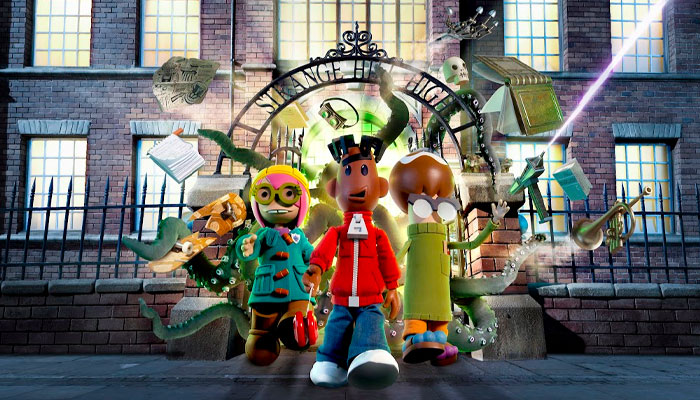
If you position the brand correctly at as early a stage as possible, then there shouldn’t be any major misalignments between the brand and the market. In this case, CBBC conducted audience testing of the show. Insights from this helped us to understand what the young audience wanted, and this all fed into the brand and design.
There were later discussions on the licensing side about target ages and whether it should be purely boy-focused brand or to aim for a more mixed appeal. Because the positioning work had been done up front, the decisions broadly followed the audience profile of the show and matched those of the overall brand.
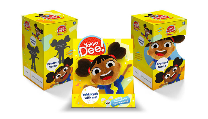
At Sharp Sharp, we conduct brand positioning work and design research to ensure that our creative is effective – as well as visually striking. We aim to get involved at as early a stage as possible in the development process. For the Yakka Dee! style guide development, we were able to collaborate closely with the show’s creators and its art director. Again, this helped to ensure that the end result matched their vision and would appeal to the young audience.
How do you think brands can stay authentic when entering the licensing marketplace?
Listen to the brand’s fans and don’t go for the quick buck! It’s easy to go downmarket with a brand but very difficult to make it more premium. Creatives need to really get under the skin of the brand. Then they can express it in unexpected ways and with well-crafted details.
Thinking of the toy category, have you seen any new designs that you think stand out?
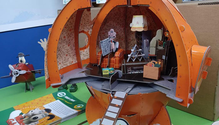
I’m a big fan of the LEGO Super Mario range, especially the way it bridges the physical/digital divide. The recent LEGO Super Mario 64 Question Mark Block is another fun iteration of this, it’s on my Christmas list already! I also love the Wallace & Gromit Rocket kit from Paper Engine. It will keep kids engaged for a long time and it’s great to see that it’s plastic-free – a rarity for toys for bigger kids.
And while 3D printing has yet to make a major impact on mass-market toys, it’s interesting to see that LEGO have been experimenting with it with their duck – it’s only available at The LEGO House for now…
Finally, if you could arrange a dinner party with three designers or brand owners, who would you pick and why?
Great question! I spent way to long thinking about this! I’ve gone for one designer and two brand owners, to keep things even around the table once I’m included!
I’m going to bend the rules a little for my choice of designer and will go for artist Jeremy Deller. I’m including him because I’m convinced there’s a graphic designer inside him fighting to get out! I love the way his work is so expansive, from his inflatable Stone Henge to music – does anyone remember the Acid Brass project? – to more graphic artworks such as his ‘Strong and Stable My Arse’ poster.
My first brand is Nintendo, represented by Shigeru Miyamoto – a huge creative force behind the company, and creator of many of their games from Super Mario Bros onwards. I’d love to discover the secrets behind how he makes content which is so simple, joyful and un-putdownable.
And my second brand would be Aardman. I’d choose their filmmaker Nick Park to represent them. It would be a chance to hear about the incredible level of craft that goes into their work and how they’ve translated this into a successful brand licensing business.
Great picks. Steve, a huge thanks again for taking time out for this.
Enter your details to receive Brands Untapped updates & news.