—-
To stay in the loop with the latest features, news and interviews from the creative community around licensing, sign up to our weekly newsletter here

Wow Me Design’s Andy White talks briefs, collaborations and the power of Wow Me’s Brandscape tool.
Andy, it’s good to connect. Firstly, can you give us some background and history to Wow Me Design?
We set up Wow Me because we identified a need for a creative packaging design agency that catered for a growing youth market. At the time there were lots of FMCG agencies, but none of them really catered for – nor understood the subtleties in – designing products for this growing market.
The four partners involved in Wow Me all had previous experience in licensing and licenced products. We cut our teeth creating products for Disney, Warner Brothers, Hasbro, SEGA – and these were the days before style guide art, so we had to create it all and then get it approved! We all shared a real passion and enjoyment for this type of work – we were four big kids colouring in!
Seriously though, we all had skills that complimented each other so when the opportunity to start something together, it was a no-brainer for me.
What was those early days of the company like?
It was tough at the start at first. We didn’t pay ourselves for the first six months, so I lived in a caravan to keep my overheads down – great fun, but not when it was cold! Soon we started to get some traction with clients who liked the way we did things and our approach to design. From that point on, we’ve never really looked back. Being busy has meant that 18 years have flown by!
“We’ve found our eclectic mix of work categories helps our design team stay fresh and motivated.”
Has the company evolved or changed much in those 18 years?
We’ve obviously added staff to the team and expanded into new premises, but we’ve always maintained an organic growth to the business. We’re always mindful not to over stretch ourselves or put all our eggs in one basket so that we, and our staff, feel secure. Along with the business, the work has changed over the years in that as well as our core toy and youth clients, we now work for more FMCG and retail clients too.
On that, how do you ensure as a company you understand these different business sectors and offer a relevant design service to them?
We’ve found this to be a positive. Working in different categories and sectors means that the learnings from one can help us in others. It also helps us spot early consumer trends and changing markets by analysing different categories. Yes, we must change our processes a little for each, but they all still employ a core design process – that’s a constant. There is a subtle difference, each with their own nuances, but we always put ourselves in the shoes of the consumer first and foremost.
We’ve also found that our eclectic mix of work categories helps our design team to stay fresh and motivated. One day they can be working on some NPD, the next a new product extension, the next a new brand development…
And in your experience, what makes a good design brief?
There’s no such thing as too much information! Over the years we’ve seen a vast array of design briefs, from a one liner to full on document. Before pen hits paper, this is where the creative process really starts; exploring and challenging the brief at every touchpoint to see if it can offer new information that helps us define our approach.
Whenever we receive a brief, we always analyse the information and confirm the detail with the client first, paying particular attention to the ‘why’ within a brief. This always ensures that the brief is focused on the end user so that their needs and wants are met. Now we are out of the other side of a pandemic, we place big emphasis on talking to our clients face-to-face and not just on video. We think a lot can be learnt from a conversation – and we’re nice people to talk to!
You place a lot of emphasise on your people and teamwork. How do you approach collaboration in the design process?
We are designers, but first and foremost we’re all consumers. With that, we can collectively bring a lot of life experience to a brief. We have a process of constant review of our work, whether that’s internally or with clients, and its key to ensuring that our creative stays on brief and is effective.
This review process internally can be a creative one, or include the project team and in some cases, involve the whole studio. Everyone’s view is valuable – we try to leave no stone unturned and no question unanswered.
One of the tools and services you offer is ‘Brandscape’. Can you tell us a little more about this and how this works?
A brand is often referred to as the space that a product or service occupies in the wider world. Brandscape is our term for how the wider world sees that brand. A brief usually tells of the tangible and deliverable elements of a project, but Brandscape offers us an insight into the emotive relationship to a brand. It’s an invaluable window into the beliefs, insights, behaviours, habits and trends that exist around products and brands.
“Brandscape is a window into the beliefs, insights, behaviours, habits and trends that exist around products and brands.”
We can dial up or dial down Brandscape and its role within a project depending on how appropriate it is and how insightful it needs to be. We have found by digging into the smallest details associated with a category, this strategic process of ours can reveal some important truths about the role of a brand in people’s lives. We’ve found it to be an invaluable tool in helping define briefs but also as a measure to creative solutions and strategy.
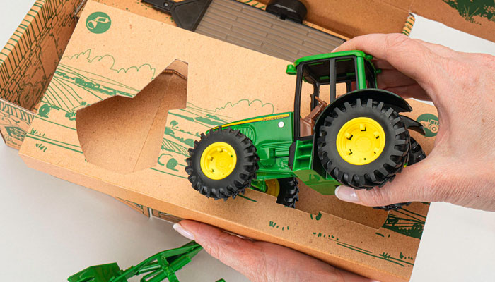
Thinking about some of the specific projects you have been involved in, I noticed you worked on TOMY’s Farm in a Box product. Can you tell us about the thinking behind it and what you learnt from the project?
TOMY originally approached us to look at how we could include some play value to their classic farm product. Our Brandscape tool showed us early on that there was a consumer appetite to create packaging that was easy to open and that didn’t include plastic fixtures and fittings – at this time the toy industry it seems was constantly being vilified for over packaging. So we thought: “Why can’t we create something that was just card and that’s it, nothing else.”
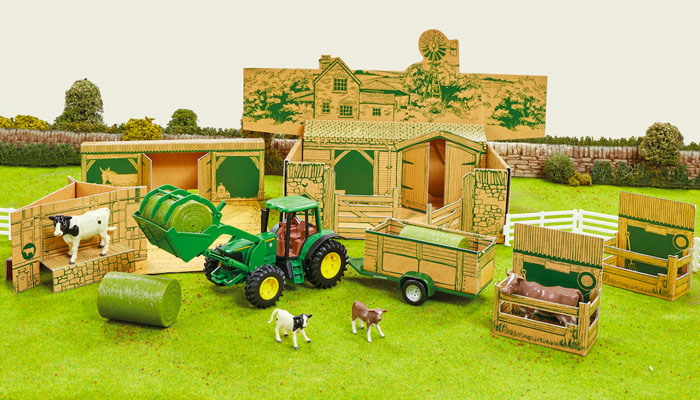
We set about creating Farm in a Box – farm buildings and accessories that were made from every single element of the packaging. Nothing was wasted, it all folded out to create an imaginative compliment to the diecast product – and folded away again when play was over. It was illustrated by our team and printed on recycled card with a single colour plant-based ink so that the packaging could be coloured in if kids wanted to.
With the addition of a simple sleeve, the pack could be made retail ready in an instant. It was not only effective as a piece of theatre, but it required no real changes to production and on top of this, we also reduced the packaging by 50% volume!
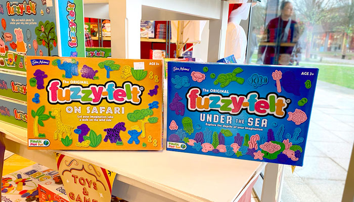
Fantastic. Well done on that. Likewise, I know you have just been involved with a design refresh for Fuzzy Felt, a much loved and iconic brand. How do you approach a design brief like this? Is it harder to work with a classic brand design-wise?
John Adams acquired the Fuzzy-Felt brand and because of our long-standing relationship with them working on many of their games – like Go-For-Broke, Giddy-Up and their New Scotland Yard forensics range – they asked us to look at this iconic brand for them.
Of course, the key thing is that we had to be respectful to the brand. It has a long history evoking many a happy childhood memory for people. Because of its history, it actually made it easier to work on. I don’t mean that the project was easy, but seeing where something had been made it clearer where it needed to go.
At the conception, there was a big shift in consumer behaviour favouring toys and games that were not electronic-based. Fuzzy-Felt fitted the need perfectly. The old pack had started to look a little cluttered, and even the Fuzzy-Felt logo had started to get lost on pack with poor legibility. We decided that the logo needed to take control again and set about decluttering the pack and cleaning up the logo to be bold and confident.
Sometimes it’s the little things that make all the difference… The original logo used multiple colours, something we retained, but the previous version used yellow on a white background. This made the letters very hard to read at a distance, so we opted for a different colour palette. Of course, we still had to communicate the sense of fun and imagination to be had with the product, by treating the front face as the board and having the felt pieces interacting with each other.
Thinking about working on licensed properties. How do you manage a design brief that involves a rights holder and a licensee. With more than ‘one voice’ to be listened to, how do you ensure that all views are taken on board?
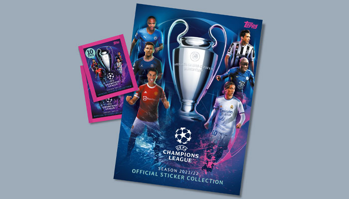
Projects that have more than one voice can be challenging. For example, we work with Topps on a range of their football products which can have a crazy number of parties that need to approve a design. In some cases, it’s not only our client that needs to sign creative off, but also the football association involved, the individual clubs and, in some cases, the players themselves! It feels like there’s always compromises to be made in these situations.
Initially, it may feel like restrictions might stifle the design process, but in fact the opposite is true – if you know what everyone wants from the start of course! Communication is key. We would always want all parties involved to be at the start of the project so that we can fully understand the expectations; the brand dos and don’ts. This ensures we don’t create something that won’t be approved and avoid any surprises that could potentially jeopardise the timelines for a project – sometimes we just have to get it right first time!
That’s a lot of pressure, but our experience dealing with rights holders and licensees means that we can always deliver solutions that keeps everyone happy without compromising our service.
If you were advising a design student in regard to getting a job with a design agency, what advice would you give them?
Be a sponge! Try to soak up as much information as you can – from books, webinars, blogs, from mentors, from your peers… And not just design stuff! Learn about business, about people and what makes them tick… Learn about yourself. Surround yourself with people, make friends with everyone so that you can review your work, collaborate, make like-minded connections, get a job referral. Don’t ever stop being a sponge, ever.
Great advice. Finally, if you were the curator of The Design Museum for the day and you were allowed to exhibit three iconic brands of your choice, what would they be?
Tricky one this – there are far too many great brands to choose from! So, as it’s my museum for the day, I’m going to champion some inspirational people instead.
The first, is Harry Beck, famed for creating the London Underground map. Well-trodden ground this one I know, but it’s there because of that moment of clarity when he realised that it was not necessary to portray accurate distance and position on the map. This allowed him the freedom to create the map that has become an icon of our capital and has been emulated for subway networks all over the world. It’s been amended and edited over the last 90 years, but it’s core design aesthetic is still clear to see.
The second is a man that pretty much defined the look of movie posters for over 40 years: Drew Struzan. You may not be aware of the name, but you’ll know his work for films like Back to the Future, Blade Runner, Raiders of the Lost Ark, Star Wars and Harry Potter. His unique style and composition have become the benchmark of movie poster art. It reminds me that great craftsmanship can elevate a product to be more than just a marketing tool – it becomes something to be coveted.
And finally, Ryan Hughes, a graphic designer, illustrator, typographer and comic book artist. His unique style has adorned book covers, Posters, CDs – remember those! – clothing and ad campaigns, as well as brand marks and logs for the likes of Marvel. The influence of graphic styling from past decades, particularly the 50s, is clear to see; reinvented and crafted to create a unique design language that has had a huge influence on design culture for over two decades – he’s the king of retro styling.
Andy, a huge thanks again for taking time out for this. Let’s tie in again soon.
“A gentle moral, a touch of humour, and a lot of heart…” Emma Soames talks all things Cabbage and Tyler.
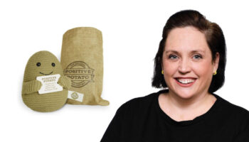
Bex Coster talks us through the creation of Positive Potato and recent brand extensions with PMS.

“From IP to impact”: Brad Page on crafting immersive brand worlds through merchandise, marketing and digital design.
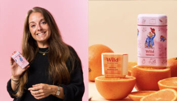
“With it being Wild’s first character licensing deal, it’s been special”: Grace Tedstone, Licensing Brand Manager at Wild, talks us through the company’s licensing strategy for this year and beyond.
How did the Instagram account A Daily Cloud became a board game? Inventor Tim Walsh tells all.
Jon Morgan – Creative Director at CAA Brand Management – on the agency’s newly launched consultancy service… And what fuels his creativity.
Enter your details to receive Brands Untapped updates & news.