—-
To stay in the loop with the latest features, news and interviews from the creative community around licensing, sign up to our weekly newsletter here

Jude Coram, owner of Apparel of Laughs, talks us through his new Aardman collection.
Jude, can you tell us a bit about your path to becoming a designer?
Ever since I was a kid, I had a love for creating art on my trusty family PC. The ability to come up with crazy designs and ideas without needing anything more than a computer mouse was great to let my young imagination flow. My mother was an art teacher, so I picked up a lot of inspiration from her growing up. I also went to a great primary school that really championed digital art and design. Teaching young students photo editing, game creation and stop-motion animation is a great way to get them into the digital world with some great skills.
By the time I was 13, my one Christmas request was for the Adobe Creative Suite. I was able to tinker around with the software and learn through trial and error for years, before finally putting my newly honed skills into practice. In my final years at secondary school, I found a US website that ran contests for t-shirt designs. After plenty of failed attempts, I finally won a competition and got paid handsomely for my victory. It was then I realised that I could make a career out of digital illustration and graphic design.
Talk us through the sorts of projects you take on.
I’ve done plenty of interesting and varied work in the seven plus years of my freelance career. I’ve turned my hand to almost anything that can be created on a computer. Regular work like logos and websites are my bread and butter, with t-shirt design being my real passion.
I’ve worked with many happy clients all across the world, from the US to Australia – and most places in between. That’s the beauty of the internet and my job, you really work with almost anyone in the world, with very few roadblocks or limitations.
I’ve built up quite a varied portfolio with plenty of different work in many different industries. Some of my proudest work outside of my t-shirts has been cathedral Christmas cards. I’ve designed a modern Christmas card design for Exeter Cathedral for the past five years, which also led to me designing a card design for St. Pauls Cathedral in 2019 and Newcastle Cathedral this year.
I know you also run an e-commerce site selling t-shirts called Apparel of Laughs. Can you tell us about this?
I mentioned I started my love of designing t-shirts through a US website that was running competitions. Although I had won a contest and a few editor’s picks, I started to really notice how most of the designs I was competing with had a better knowledge of American culture. I’ve never been too hot on American TV, films or celebrities… Give me Only Fools and Horses any day! As such, I was at a disadvantage in creating designs that would appeal to the US public. This was when I thought about creating a site dedicated to the best that British culture has to offer.
I started creating some very UK centric designs and just uploaded them to my new site, called Apparel of Laughs. As I had made the site myself, I was able to take some time to build the shop up as I wasn’t paying someone to do it for me. Since the day I officially launched in October 2019, I’ve added over 600 of my own unique designs to the site for purchase. These designs celebrate the TV, films, literature, sport, and even food of the UK in a range of different artistic styles.
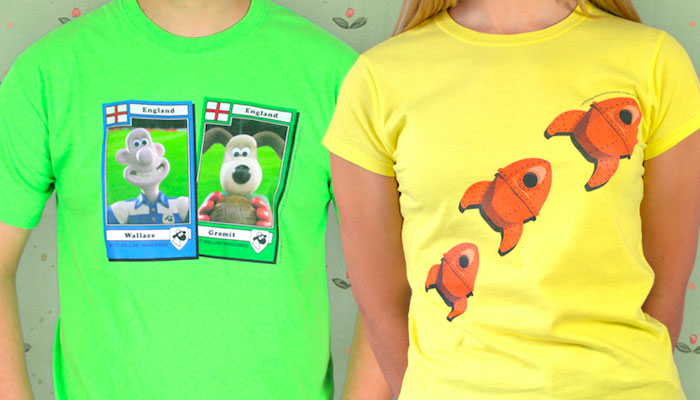
Apparel of Laughs sells a range of Aardman t-shirts that you have designed – and I know you are an Aardman fan! What can you tell us about the design process behind this range?
Well, I tried to go down a few less conventional routes. Wallace & Gromit have been a cultural institution since the Eighties, so most simple designs had already been used for years on merchandise. I wanted to go a bit deeper into the films, bringing out some recognisable – and some more obscure – details from the classic films.
I spent a lot of time watching the films, pausing at different moments to get the details I needed for the designs. I was also given access to a brilliant library of assets created and curated by Aardman that I could use on any of my shirts. I’ll be honest, I spent a long time just marvelling at all the art and creativity on show just in this library!
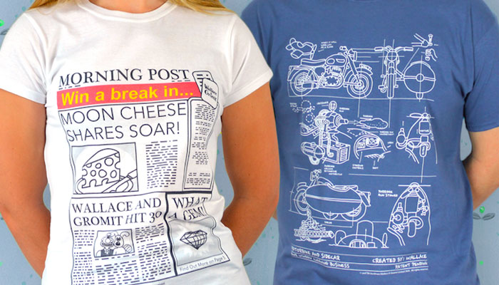
Thinking about the Aardman range, how do you alight on new ideas and ‘think like a fan’ when you are designing?
I suppose, because I am a massive fan, I try to think what would I like to wear to represent my love for Wallace & Gromit. Often with shirts, people buy them for themselves because they love the design and they “get it.” Whether anyone else would understand the shirt often comes second in people’s thinking. I’ve tried to weigh this up with my range of 15 designs.
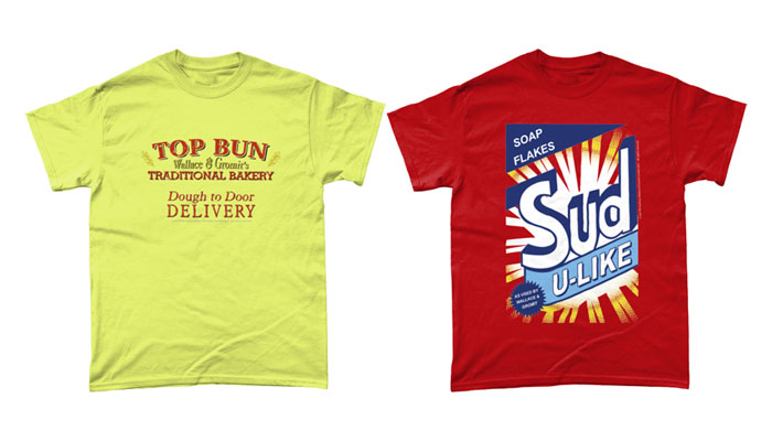
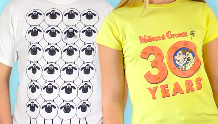
A few of them are obviously Wallace & Gromit – they have pictures of them from their classic films. Other designs in the collection are more niche and reflect the depth of storytelling in the movies. A discerning fan of Wallace and Gromit should understand all the shirts and would be delighted when another fan understands the more niche designs too.
Are there other apparel brands and designers you look to for inspiration?
I am always inspired by other people. If money was no object, my home would be full of original art and my wardrobe crammed with comedy t-shirts. My two favourite designers are Wenceslao Almazan and Adam Koford. These are who I aspire to when I create my work.
Wenceslao has created a superb style for his illustrations which works brilliantly on t-shirts. He manages to turn pop culture references into super cute designs perfect for all ages. Adam’s work is also fantastic. I love his simple cartoon style that he uses to create funny and memorable designs. His work is just great to look at and so appealing.
If I’m going closer to home, I love the work of Moose Allain. His work looks so simple, but I know that level of simplicity and skill takes years to master. In just a few strokes of the pen he can convey a brilliant joke, and yet his more complex drawings draw the eye and you can be looking at it for ages without seeing everything. Truly a master of the art with a great sense of humour.
Do you have a process for creating new ideas? How do you start?
I get inspiration from everywhere. I like to think I’m pretty embedded in British culture so when I’m watching TV or films or just walking around town, an idea might come to me. Sometimes I just get a stupid pun in my head and turn that into a design. There is a site that I’ve used in the past that just brings up random words and icons which my scatty brain can sometimes conjure into a t-shirt idea. I have a huge list of ideas on my phone that I’ve never used and most are so random and stupid that they will never see the light of day. Others aren’t fully formed in my head until months later when I might fully get into having a go at actually designing it.
Once I’ve got a good idea of the design, I tend to roughly draw it out into one of my notebooks. It really doesn’t have to look good, it’s just a nice place to start in regards to concept and composition. If I can get something half decent on paper, I then bring the idea to the computer. I mainly use Adobe Illustrator for most of my designs, with Photoshop being more to get the designs ready for printing. Working with vector art in Illustrator allows me to scale and move the art around without losing the quality and making it blurry. There is nothing worse than a blurry t-shirt!
When I am happy with my final result, I can then add it to Apparel of Laughs and see if my customers like the design as much as I do! The beauty of having my own site is that I can try all sorts of designs and chuck them at the wall so to speak to see what sticks. I’ve been really surprised by what designs became popular and which ones are left on the scrapheap.
Thinking about 2023, how do you see the apparel market developing? Are there trends on the horizon you are aware of and adapting to?
The one big thing everyone has been talking about recently in the art world is AI. If you’ve been anywhere online in the last six months, you would have seen the massive improvements in the world of artificially created ‘artwork’.
I always felt that art would be one of the last things AI could accomplish. Sadly, this isn’t the case. A lot of designers, me included, are worried at where this will leave our industry. If anyone can create a half decent piece of art with just a few sentences of text, who will pay an artist maybe 10 times more for their work?
I don’t think it will be too long before these art generators will be plugged into these sites to produce more visual designs. Things like ‘The Flintstones in the style of The Simpsons’ or ‘Darth Vader riding a T-Rex’ are easy prompts that would translate to t-shirts. If an A.I makes 1,000 shirts and only 10 are any good, those 10 could still sell well and take away sales from an actual artist. I think it also opens up some very grey areas with licensors as to how far they will let this slide. I can see a lot of copyright infringement and plenty more court cases over the next few years as this technology improves.
For designers like myself, this new wave of art should make us focus on bringing about better products with added meaning and story, rather than trying to appeal to the lowest common denominator.
Fascinating insight. Thanks Jude. I have one last question… Do you have three favourite t-shirt designs that you have seen and admired? What are they?
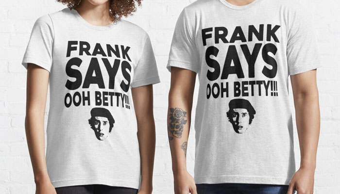
Frank Says Ooh Betty… I love this shirt. It’s so stupid but does what I love. It plays off two different things and combines them into something funny. To take the recognisable slogan shirt of Frankie Goes to Hollywood and turn it on its head with a memorable sitcom catchphrase is a great idea. I wish I’d come up with it before they did.
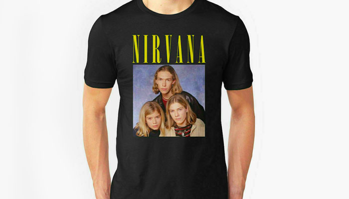
Hanson Nirvana… This shirt makes me laugh every time I see it. It plays on the idea that some people who wear band t-shirts probably don’t really know the band or any of their music. To have the safest and cleanest boy band of the Nineties – Hanson – swapping places with the kings of grunge – Nirvana – is a great way to spot the real fans from the fake ones.
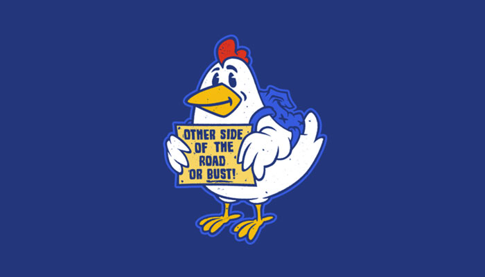
My third choice is an actual artist’s design: Hitchhiking Chicken. When I first saw this hitchhiking chicken shirt by Blair Campbell I knew I had to get it. Every time I see it, it cracks me up. I really think having something in your wardrobe that brings a smile to your face is worth having. That’s what I’ve tried to achieve on my own site… Even if you don’t buy the shirt, you’ve at least got a laugh from it anyway!
Great picks! Thanks again for this Jude.
Enter your details to receive Brands Untapped updates & news.