—-
To stay in the loop with the latest features, news and interviews from the creative community around licensing, sign up to our weekly newsletter here
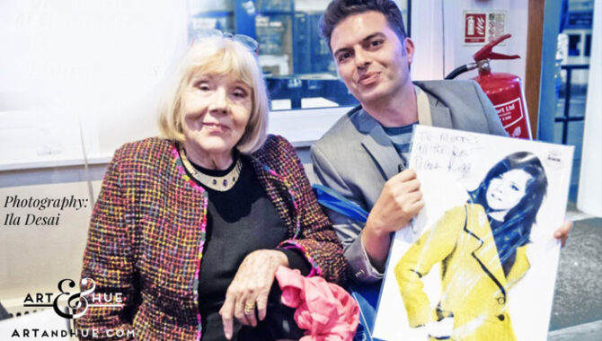
With the 10th anniversary of Art & Hue approaching, Odysseas Constantine tells us how he approached creating pop art pieces for an eclectic raft of brands.
Odysseas, thanks for making time for this. Could you give us a brief introduction to Art & Hue?
Thanks to Brands Untapped for the interview. Art & Hue launched in 2014 with a selection of pop art prints based on various themes, as well as the option to create bespoke pop art from customers’ photographs.
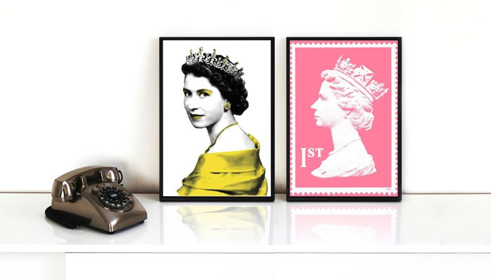
Seeing the joy that bespoke artwork could bring to friends sparked the idea to offer bespoke prints to a wider audience, as well as to create prints on themes that I find interesting and stylish… Icons like The Queen or TV shows – or simple mid-century objects such as a lamp or telephone…
“Rather than create a collection based on the Ashmolean’s exhibits, I wanted to celebrate the institution itself.”
The pop art prints come in three sizes and many colour options, all on 310gsm museum-quality archival card and made from 100% cotton – with fine-art pigment inks for longevity. Despite recent inflationary pressures in supply costs, I’ve so far resisted passing on the increases to customers as I’ve always wanted the prints to be as affordable for as many people as possible to bring style and joy to their walls.
And you also have a very successful career as a designer outside of Art & Hue?
Yes, but while I’m still happy to work with brands of all sizes as well as individuals, the response to Art & Hue has meant most of my time is now taken up with researching new collections and printing art to send around the world. And while nailing a client’s design brief can be rewarding, or consulting with brands on their creative direction and forecasting can be stimulating, Art & Hue is my very own way of creating work that reflects my personal aesthetic and interests.
I’ve always been happy to devote time and effort when experimenting and creating art prints – even if they never get released, they’re completed to see the final results… While time-consuming, it’s always an enjoyable process to research, create, and edit artworks, even if the whole process takes months.
“I would love to tuck into a food brand’s archives to transform vintage images and ads into stylish pop art prints.”
Returning to Art & Hue, you recently launched a collection in collaboration with The Ashmolean Museum. Can you tell us about the creative process behind this collection?
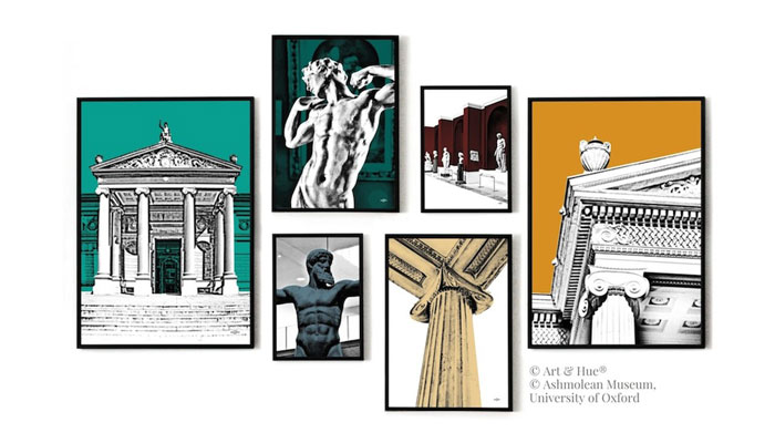
The recently-launched Ashmolean print collection transforms images of the Museum’s exterior and interior into pop art subjects. Rather than create a collection based on the Ashmolean’s exhibits, I wanted to celebrate the institution itself. Most Art & Hue prints are available in the in-house palette of 20 colour options but as the Ashmolean had an existing paint collaboration with Graphenstone, it seemed right to offer the prints in the colours of The Treasured Collection of paint… It reaffirms the Museum’s identity across their product offering.
Art & Hue certainly has a distinct design style and feel. How do you maintain this look when working with some a diverse mix of subjects?
Thank you for saying that. I suppose this has come about naturally over time by applying the Art & Hue style to so many diverse subjects that it’s created its own pop art universe. With the 10th anniversary of Art & Hue approaching, it was quite the surprise to tot up all the previous pop art collections and realise that there have been 117 collections to date since 2014 – of which over 90 are currently available, totalling almost 690 individual prints! Considering the prints are available in a choice of colours and sizes, that’s approximately 42,000 options!
The primary style of Art & Hue uses graphic imagery for an authentic pop art feel, but keeps images clean with blocks of colour for a fun and stylish result. To my eye, it’s like finding a small image in a vintage magazine and enlarging it to see the ink detail, but perhaps cleaner.
Although I should point out that there are some prints which don’t use this technique but still capture the Art & Hue style… These include maps like the recently-launched Movie Map of America, which has over 270 performers from the golden age of Hollywood, and graphic illustrations of various icons such as spies and soap actresses.
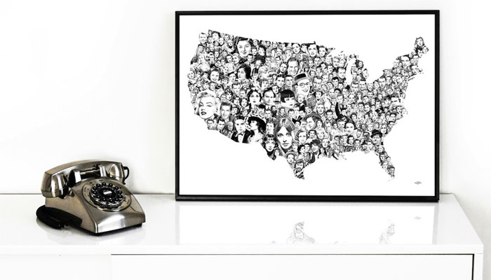
I noticed that you have worked with the likes of Ealing Studios, the Carry On films and Hammer House of Horror. Do you find cinema and film fits well with Art & Hue?
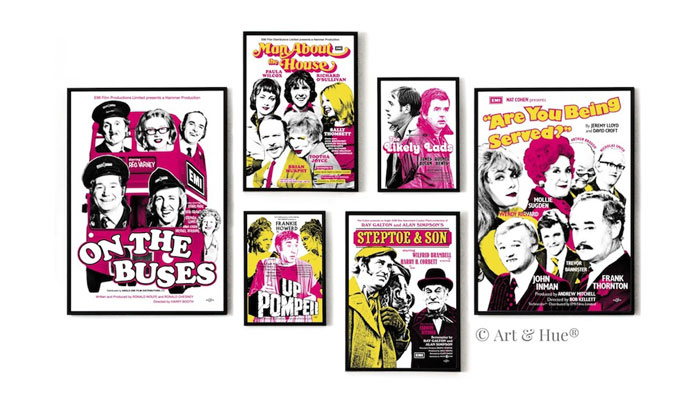
Film & TV has been a great fit. As I mentioned, the prints can sometimes feel like enlarged clippings from retro magazines, but simplified for a clean & stylish look, and the film and TV prints feel like spotlighting images from vintage magazines such as Photoplay or ABC Film Review. The Art & Hue style transforms images into pop art icons so when it’s applied to existing icons of popular culture – such as The Avengers and Carry On films – it seems to amplify the impact.
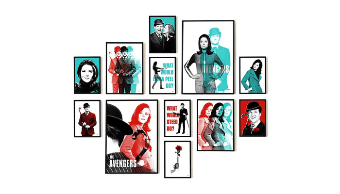
The majority of the film and TV collections have been created in collaboration with STUDIOCANAL who have been a pleasure to work with since 2015. They’ve been very generous with their time and archive which has allowed me to experiment and create pop art collections on various themes, such as the Ealing Studios comedies you mentioned. STUDIOCANAL are one of the largest film libraries in the world so the breadth of their classic titles is astounding, from The Third Man and Billy Liar to The Wicker Man and School for Scoundrels.
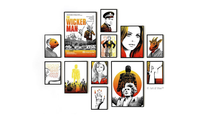
Is there a ‘typical’ consumer for Art & Hue?
I wouldn’t like to stereotype Art & Hue customers and I honestly can’t think of what a ‘typical’ customer would be. All are unique individuals, but I suppose it’s fair to say that the majority of Avengers fans, as an example, remember watching the show – either during its original run in the 60s or the repeats on Channel 4 in the 80s & 90s as I did.
I’ve had the pleasure of interacting with many customers, via email and the mailing list, and particularly on the Art & Hue Facebook page and in groups where we can show our appreciation for classic films & TV shows. There’s a feedback section on the website with some previous comments from customers and it’s always a thrill to know that the pop art prints are bringing style and joy to people’s walls in homes around the world.
What is in the pipeline for Art & Hue for the rest of 2024?
I like to work in advance so have collections scheduled up until the end of September with ideas for beyond that I’m currently working on. I won’t give away any spoilers except to say there are more film-related collections, as well as more prints inspired by fashion and travel, on the way.
Finally, is there a subject or theme that you would love to curate for Art & Hue but you haven’t managed to do so yet?
Food. I definitely don’t have enough food-related pop art, other than the popular print of Beryl Reid from Entertaining Mr. Sloane enjoying an ice lolly.
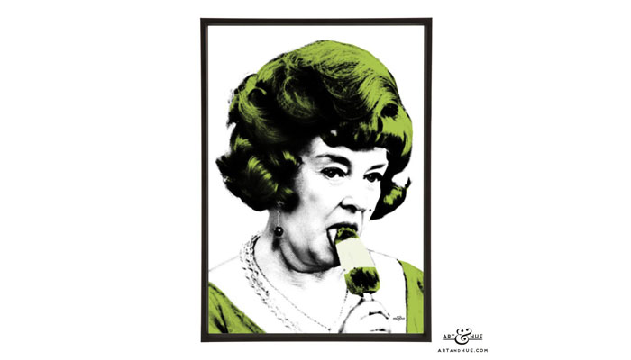
It’s always been in the back of my mind, but I get drawn to another film or cultural anniversary and food gets put on the back burner, as it were. I have pop art with drinks – cocktail hour is very important – but I’m going hungry for food prints. So, if Brands Untapped could dish up any heritage food brands who are reading this, I would love to tuck into their archives to transform vintage images and ads into stylish pop art prints for customers to devour!
We’ll put the word out! Heritage food brands, get in touch! Thanks again Odysseas – and people can check out your work over at https://artandhue.com/.
Enter your details to receive Brands Untapped updates & news.