—-
To stay in the loop with the latest features, news and interviews from the creative community around licensing, sign up to our weekly newsletter here

Maria Thomas, Director at Doodlebug Design, discusses the key to designing a great style guide.
Hi Maria. Could you give us a brief introduction to Doodlebug Design and how you work in the licensing sector?
We are a graphic design agency that has been working in the licensing industry for over 25 years. We work closely with licensors on style guide development and design. This includes the creation of design assets such as patterns, borders, badges, icons and so on – as well as all the packaging elements that licensees need to create their products and packaging.
The layout and design of the style guide is an integral part of creating the overall licensed brand. We also create product concepts for new brands to help show how the new guides should be used in developing ranges and packaging.
We also work with several licensees on product concepts, flat and 3D visuals through to artwork and on marketing materials to help promote new brands and products in the form of leaflets, brochures, animated gifs and so on.
What makes a good style guide do you think?
They should be easy to use and easy to understand, with plenty of assets within each section for larger ranges, and themed sections to create variety.
If you were advising a manufacturer who is using licensing for the first time, what would you encourage them to think about in terms of design, development and working with a rights holder?
We would encourage all new licensees to work closely with the guide provided. There will be product examples in the guides but be careful not to just lift all the ideas – be creative with the tools you have been given! Working with an experienced agency is a good way to start.
“If your designs are strong and innovative, they will translate worldwide.”
How important is it to think about designing for social media in mind? How do you ensure what you are designing stays relevant for these kinds of platforms?
It’s very important! Social media platforms are the way forward and have been for years now. These days, your business can survive without a complex website, but links to your social media will keep you interesting. It’s more important to be interacting with your customers daily to keep in the forefront of people’s minds and eyes. Keep up to date with trends and keep your designs fresh and forward thinking.
Keep up to date with trends… What are some of the ways you do that?
Design trends filter through from high-end design settings to the high street. Take an interest in design shows; from fashion to home you can see how trends dilute and are embraced with a more consumer-lead focus.
Attending trade shows, reading magazine articles, visiting museums and exhibitions… This all keeps you stimulated and ensures that you keep up with the latest ideas that you can then filter through and translate into your designs.
Licensing is an international business. How do you ensure your design work reflects international demands and requirements?
If your designs are strong, follow the latest guidelines and are innovative, they will translate worldwide without the need to produce multiple ideas for various countries. Avoid using text or phrases so there’s no need for translations; let the design speak for itself!
If you were advising a design student or graduate who was interested in working in the licensing sector, what advice would you give?
Licensing is a fabulous and fun world to be in. If you want to work in a fast-moving creative industry, then this is one to go for. But…
But…
Be warned it can be super hard work too. It’s not all cartoons, so do your research into other licensing avenues such as drinks brands, sports brands, houseware brands and so on – as well cartoons!
Maria, thanks for taking the time. I have one final question… If you were running a retail outlet, what would be the first three licensed products you would stock in it and why?
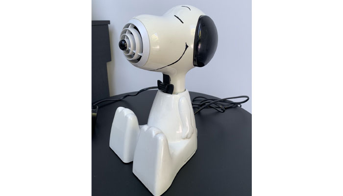
First has to be a Snoopy hairdryer. Snoopy was my absolute favourite when I was growing up and I never had one of these! My business partner Sian did and I was always jealous, so if they made a new version of this I would definitely have this in our store. I think it’s genius how his snout makes the perfect hairdryer!

So it does! What’s your second pick?
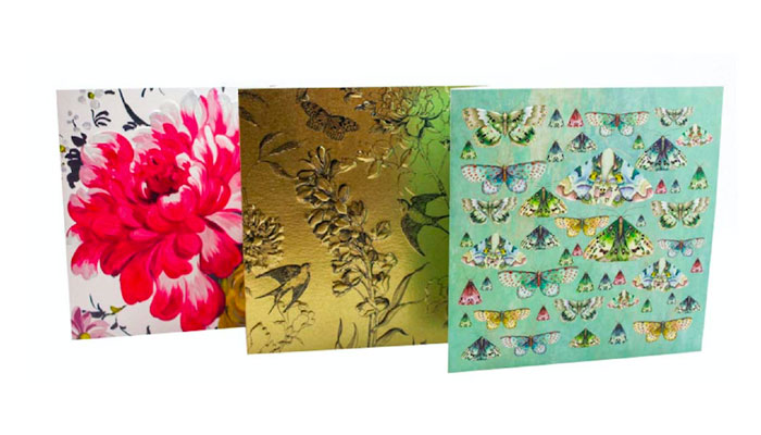
I am a textile designer at heart and I love Designer Guild. Their collections are so colourful and tactile. I always love a good look through the store for inspiration, so if we could stock their greetings cards, they would definitely have a prime slot.

Interesting pick! And last but not least…
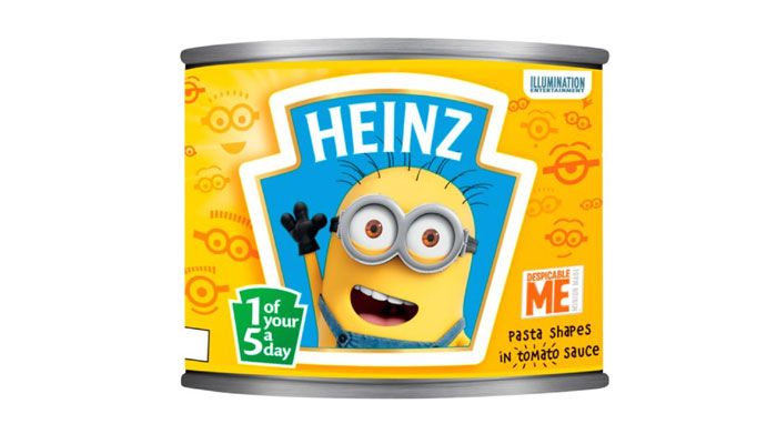
Heinz Minions Spaghetti Shapes! Always a firm favourite growing up, I love the packaging which lends itself to the Minions brand and I am hoping that the shapes are the Minions’ eyes because I think that would be so cool!

A cracking line-up!
I think our store would be quite eclectic looking at those choices – Ha ha!
I’ll be first in line on opening day! Thanks again Maria.
Enter your details to receive Brands Untapped updates & news.