—-
To stay in the loop with the latest features, news and interviews from the creative community around licensing, sign up to our weekly newsletter here

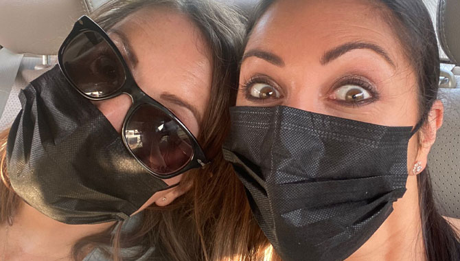
Paula Rich and Christa Mavroudis discuss creativity, collaboration and Dot Dash’s own print and pattern work influences how they create for brand partners.
Dot Dash Design is a leading UK-based design studio, working with well established brands on everything from style guides to packaging, while also creating their own designs for license under the firm’s Dot Dash Studio banner.
We spoke with Dot Dash Design’s Paula Rich and Christa Mavroudis about creativity, collaboration and how the firm’s own print and pattern work influences how they create for brand partners.
Paula, Christa, it’s great to catch up. Let’s start at the beginning – how did Dot Dash Design come about?
Paula Rich, Owner, Dot Dash Design: Dot Dash Design was founded over 12 years ago by myself, Christa and Nick. We all worked together at a supplier to M&S at the time. Nick and I had started to work on a new project that involved creating style guides. The diversity of working on different creative projects was really exciting and introduced us to lots of different brands and brand owners. There were lots of changes happening at the company at the time, so we decided to take a leap of faith and go for it alone!
That was in 2009, right at the start of the recession – so we didn’t know if we were doing the right thing, but it seemed to work! Because we’d already built relationships with a few licensors, we hit the ground running and got our first few projects.
Dot Dash Design has evolved through the years and Nick has since left the company. We continue to grow and have a team of dedicated designs and illustrators that share our creative vision.
Can you recall one of Dot Dash Design’s first projects?
PR: It was with the BBC on a Charlie and Lola project. Our background in fashion and textiles was a perfect fit to create a fashion guide for the brand. Funnily enough our expertise in fashion and textiles – which stems from our manufacturing background – has been an integral part of our growth as a business and has influenced our move into the art licensing space.
“We’re always thinking of ways to reimagine brands and character art in a way that stems from what we’re doing with surface patterns.”
Talk us through your approach to design?
Christa Mavroudis, Director, Dot Dash Design: The key factor in anything we design is in first understanding the client’s customers and working backwards from there. Every design project is different and before we put pencil to paper – so to speak! – we like to really understand who we are designing for, where the opportunities are for our clients and really making sure we have total clarity on the brief.
We have certainly found that putting in the homework before you start designing always leads to a more successful outcome.
When it comes to creating style guides, do you prefer working with brands that have a clear framework – like characters, worlds, movies, TV shows – versus brands where you’re creating elements pretty much from scratch?
CM: It really doesn’t matter how far down the process a client is when they approach us. In fact, I would say we thrive on the challenge of variation in our projects.
One of the great benefits of taking on such diverse projects aside from it being fun is that it really helps to sharpen your team’s skills and builds up their confidence to tackle any challenge.
For example, a few years ago we were asked to create three style guides for a theme park in Moscow that hadn’t been built! It was a huge challenge – creating character concepts from scratch just based on a traditional Russian fairy tale or an idea for one of their attractions. The project evolved so much throughout the process, it was a huge learning curve for the team and a brilliant experience.
We sometimes see IP move into areas that seem – on paper – quite left-field. How important is it for brand owners to let their IP breathe and stretch into new areas?
CM: Absolutely, you have to! There are so many licenses out there, you have to evolve to stand out.
We are always exploring new poses and graphic techniques for our key clients by pushing the boundaries in terms of trend and product direction whilst still being authentic to the brand’s core values. Brand owners that are open to trying new things and being innovative seem to do really well in our experience.
“There are so many licenses out there, you have to evolve to stand out.”
You guys are prolific designers and have worked with brands for years. Do you think the licensing industry recognises the value and the contributions of designers?
CM: When we see ranges that we worked on win awards, we obviously feel really pleased for our clients and it really is a positive validation that we delivered quality work. I think it would be great for our industry to recognise the design and creative talent that helps propel what we do forward, not just at Dot Dash Design but across the board. It’s an interesting one!
It sure is! Now, are there any recent projects you guys have worked on that we can put a spotlight on?
PR: As you know it’s difficult to talk about our recent and current projects due to confidentiality, but we are working with some great new partners and are generally very excited about the year ahead.
Recent projects that we can talk about include the Alphabet Style guide for the Natural History Museum. We created brand new illustrations of the alphabet, based on different aspects of the Museum, all realised in three versions to accommodate printing restrictions for various product types. Graphic concepts were educational and included subtle environmental messaging. The guide has been successfully used on apparel ranges in John Lewis and has recently seen its way onto paper products with a range of cards at Moonpig.
CM: We have also been working with a number of publishers recently and although we can’t reveal much at this stage, some of the brands we’ve worked on include The Gruffalo, Elmer and Peter Rabbit which have been an absolute joy to work on. There are so many exciting book properties doing more and more in licensing and we feel so privileged to have been chosen to work with the best of them.
Absolutely. Now away from your work with brands, Dot Dash Design also creates your own print and pattern for licensing as Dot Dash Studio…
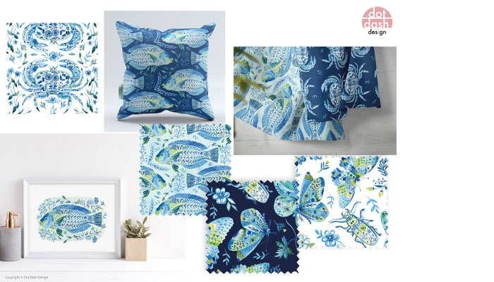
PR: Yes! We started working on our own print and pattern collections about five years ago and have slowly built up a comprehensive collection which we sell and license worldwide.
We have exhibited at Surtex, Blueprint, Printsource and Evolution Amsterdam and we absolutely love it! Most of our work is seen on product in the US but we have recently seen some of our work filtering through to UK stores such as TK Maxx – we would love to see more of this which is one of our key objectives for the next year.

CM: Creating our own prints is a great counterbalance to working with brands. It lets us execute on ideas we have had but may not have been applicable to any licence brief. Having a clean slate and the freedom to explore ensures you don’t get stuck in your ways and we certainly encourage our designers to do print and pattern work whenever they can.
Great advice. Before I let you go, how do you guys fuel your creativity?
CM: From day one of Dot Dash, we have always encouraged everybody in the company to take time and learn new skills and to stay on top of what’s new and coming next. There is a wealth of information today whether it’s on YouTube, Instagram or online classes. I personally love watching videos by other artists that inspire me and that is inspiration I can take forward to one of our own client projects. I really love creating digital art at the moment.
PR: We subscribe to some of the best forecasting tools including WGSN and get inspired there – but Christa’s right, we’re driven by learning new things. Social media and Instagram are also great for inspiration. I also believe that the work we are doing on print and pattern side, has given our licensed work a boost because we’re now always thinking of ways to reimagine brands and character art in a way that stems from what we’re doing with surface pattern.
CM: That crossover is one of our key strengths and is something we can offer that’s unique. It gives us a different perspective than most.
Guys, this has been fun. Thanks again! And I should add, readers can check out more of your work at www.dotdashstudio.co.uk and on Instagram here.
Enter your details to receive Brands Untapped updates & news.