—-
To stay in the loop with the latest features, news and interviews from the creative community around licensing, sign up to our weekly newsletter here


“It’s an exciting challenge”: Pablo Erroz talks us through the key design decisions behind his Chupa Chups collaboration.
Pablo, it’s great to connect. Before we dive into your Chupa Chups collaboration, how did you come to be a fashion designer? What set you on this path?
I have been in the fashion world for over 15 years. I would say it was curiosity and the desire to experiment that led me to become a fashion designer. I have always liked all the options in the world of design and communication. I always follow the belief that fashion is communication – probably one of the disciplines that most uniquely communicates. In addition to that, and the interest I have always had in other disciplines, the project is now transversal, with fashion as the common thread.
For anyone new to your work, how would you describe your approach to design?
Design must be transversal, able to connect, communicate and address the real needs of our times. It should improve and make our lives easier and more beautiful.
Great answer. You collaborated with Chupa Chups earlier this year. What appealed about designing for this brand?
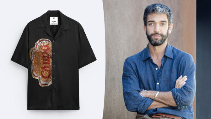
I love Chupa Chups. It’s a Spanish brand with great significance behind it. Chupa Chups represents the culture and history of our country, in addition to having perfect branding. Working with a brand like this is an exciting challenge.
Chupa Chups is also a brand with endless possibilities to explore. And that’s where the fun and interesting part was… Not doing what would be expected from a collaboration but going beyond by investigating its history and heritage.
“The logo is so recognisable that even seeing half of it, people already know it’s Chupa Chups.”
You mention the endless possibility around the IP, so how did you start?
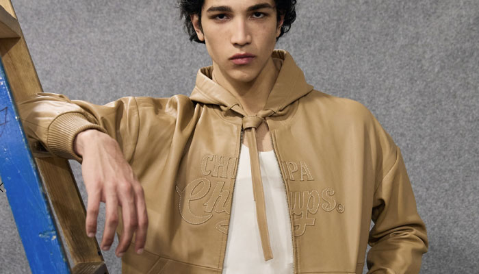
I wanted to work with Chupa Chups with the utmost respect and elevate the brand to the realm of luxury. We did this by researching its history, reviving the original logo created by Salvador Dalí, and bringing it to high-level garments – crafted in napa leather using artisanal techniques. We aimed to translate a sporty and youthful vibe into a more elevated fashion world.
At the same time, we played with the cheekiness of the word ‘Chupa’ and turned it into a very Dalí-esque element through Swarovski crystals or multifunctional accessories that can transform from a bag to a multi-use box.
Working with the Chupa Chups team was really easy. They trusted me and the ideas I proposed. This was key to being disruptive and going beyond.
You mentioned playing around with the Chupa Chups logo – what do you feel is key to its iconic status?
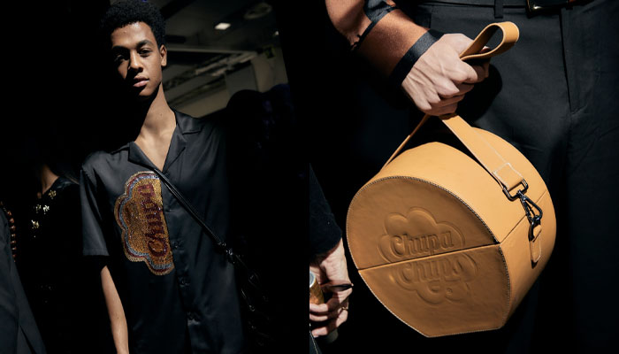
The Chupa Chups logo has such strength and a globally well-perceived image that it had to and must be the protagonist. However, we wanted to turn it around and also rescue the original logo created in 1969, tell the story, or play with the word ‘Chupa’.
“Chupa Chups is a brand with endless possibilities to explore.”
The logo is so recognisable that even seeing half of it, people already know it’s Chupa Chups. Additionally, the idea of working with the logo using different textile techniques, reliefs, engravings, embroidery, and patchwork was an interesting way to link it with fashion and the world of design in general.
Pablo, this has been great. I have one last question! What fuels your creativity?
Permanent curiosity. There is a crazy world out there. Stay curious.
Lovely place to wrap up. Thanks again!
From the rise of AI to a Hello Kitty and Friends Inflatables style guide… Jemima Chamberlain talks us through 2025 highlights, challenges and surprises.

From Baby Evie style guides to Warner Bros takeover bids… Dot Dash Design’s Paula Rich and Christa Mavroudis reflect on 2025.

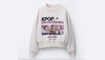
From KPop Demon Hunters to the rise of the Norman… Independent creative Danny Heffer on the highs and lows of 2025.

From new packaging guides to Feathers McGraw tattoos… Aardman’s Ilona Sunderland – Creative Services and Product Development Manager – and Ben Townsend – Product Development Executive – reflect on 2025 highlights.
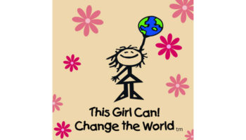
“Our character Jane is the line-drawn personification of where girls are at before they fall off that confidence cliff”: In conversation with This Girl Can! Change the World’s Jacqui Fishman.

Phillippa Green, The Royal Mint’s Licensing and Partnerships Manager, on the newly minted Monopoly coin.


Enter your details to receive Brands Untapped updates & news.