—-
To stay in the loop with the latest features, news and interviews from the creative community around licensing, sign up to our weekly newsletter here

“People watching and store visits are vital”: Danny Heffer shares his thoughts on creativity, retail and 25 years in the industry.
Danny, it’s great to catch up. Firstly, can you give us a quick precis of your career to date – and your route into licensing?
Holy cow, I’ve just realised it’s nearly 25 years! The V&A got me into the industry… I started working in product development, but the job creeped into graphics and retail interiors, moving into full time design after a while.
It was – and still is – an amazing place to work. The exhibition programme was so varied and interesting, I stayed there for six years. Vivienne Westwood, Versace, KYLIE! What a line up! I’d just moved to London and there was a real buzz about the place. Lots of hard work… Lots of parties too. The team were like family; we held a reunion last year and it was testament that quite a few are still there – including the Queen of Heritage Licensing, Lauren Sizeland. I really miss working with them.
“Projects seem smaller, but there are more of them.”
After the V&A I freelanced for a few years, working mainly on other heritage and museum projects – The Tate, The National Gallery, The Science Museum… Also some fun art projects with Gilbert & George and Antony Gormley. Again, very varied and curiosity driven; building on the things I’d learned at the V&A.
About 20 years ago I moved to Bristol and started looking for something closer to home, finally landing at Aardman. A very values-based business and similar to heritage in that there’s a real reverence for the ‘product’. That felt like home for a good while. Working across marketing and licensing, finally as global creative lead on all of the Aardman properties. I learnt so much there and that’s when I really began to understand licensing.
Last year I decided I’d run out of sheep gags and needed to move on… So I’m currently freelance, working on heritage and family-centric projects on the whole.
That’s not quick. Sorry!
You’re forgiven! Now, when you first ‘connected’ with the world of licensing what were your first impressions of the industry? And what’s been the biggest evolution?
Back in the Noughties it was a very different industry. Obviously there have been big changes along the way, with the market broadening and coming of age. The biggest change really has been the advent of social media and the internet. Connecting fans, connecting territories, creating and driving trends… I think this has made the industry much more inventive and agile. Projects seem smaller but there are more of them. Thinking differently makes you stand out and gain traction; it sets you apart from the herd so to speak.
“There’s authenticity in museum products.”
And we’re back to sheep puns! Having worked at the V&A, why do you think there seems to be an increased interest in heritage brands at the moment?
Because there’s some amazing stuff in them there collections! Actually, I think there’s a few things going on… Firstly, museums have begun to appeal to a younger, cooler demographic. The Bowie exhibition was a good example of a complete rock star sell out. Banksy at the Bristol Museum and Art Gallery was another. They’ve changed the perception and made museums a cool thing to visit – and ultimately shop at.
They’re in a unique position in that they can work with some seriously big names, but create product that’s quite accessible and affordable. The V&A Versace t-shirt outsold the Versace t-shirts by a mile, because they were cheaper – but also because they were bespoke. It gives everyone the ability to own a bit of the brand.
Secondly, there’s authenticity in museum products. If a design is in a museum, it’s usually there because it’s stood the test of time and is a design classic. Who doesn’t want that? They come complete with their own brand story, something that can take years to build.
Let’s delve into your work in creative. What makes a good style guide?
A couple of things that I think are often missed are inspiration and application. They tend to get trimmed from the budget early on, but I think there’s a real value in them. Once the assets are there, it’s really important to inspire the licensee to go beyond the original idea. Licensees will buy into the guide for a particular reason, which can be quite focused – rightly. Providing inspiration and showing how to stretch a brand gives a deeper relationship and has longer term potential; it gives everyone more bang for buck.
Application is important because it maintains the vision for how to use the assets. I often design in a way that allows multiple ways of using a graphic… But if we only see that graphic on a flat page then that can’t be shown. In that way we restrict the creative a little and it all loses some potential. If a budget is limited there are creative ways of using a single asset, but in many ways, creative application can save the need to create endless assets.
“Local audiences often mirror their identities onto the character and take from it what they want.”
Good answer! Do you have any tips for brand owners setting a brief for a style guide?
Keep the brief loose. Have a goal in mind, but work with the designer to figure out how to get there. Be careful what you cut due to budgets. More assets don’t always equate to more return, so don’t sacrifice the peripheral ‘explainy’ bits of the guide.
Have design needs and requirements changed in recent years?
In the past, it was all about the ‘core guide’. Needing a set of definitive rules that policed a brand. Today it’s a very different picture. I think the market thrives on new and bespoke, so the need is to show how this can be done, while maintaining the brand’s integrity.
How do you cater for retailers who are interested in licensed products?
Retailers increasingly see licensed product as collaborations. Retail brands are so strong these days that bringing in character needs a story and a reason. The ones that work are a delight and I think audiences get real pleasure from them.
I worked on a Shaun the Sheep x Barbour campaign recently and we really worked hard on the story there. Having animated ad content was important to the campaign as it helped explain why the two brands were together and what values they shared.
Having said that, I think the pun ‘BAA-bour’ would’ve done the job alone!
Ha! During your time at Aardman you worked a lot in the Japanese market. Can you give us some insight into that market’s needs design-wise ?
Ah, I love Japan and I loved working with the local team over there. The market is the epicentre of licensed characters. It took me by surprise in that it’s not particularly innovative, but it is everywhere. Licensed cabbages were a fave!
Design is very seasonal and very trend-led. The usual form is that a seasonal trend appears and all characters conform to this style. This year it’s softer, pastel colour with calm relaxing posing. So, brand owners need to be comfortable with that… Recolouring art, providing new poses and assets to keep up with this. I guess character is so ubiquitous that the value is in novelty – fans really want to see characters mixing with each other, influencing each other. That’s the fun.
What are the challenges for a UK-based brand owner when designing for a global market?
The first thing to understand is that one design doesn’t suit all. My experience has been that territories have individual requirements. Local audiences often mirror their identities onto the character and take from it what they want.
Take Shaun the Sheep for example. In Germany, they appreciate the wholesomeness of the world, being on a farm in the countryside. So we could steer design to focus on the great outdoors, food provenance, holidays, the fresh air… In Japan, Shaun is seen as a very calming, relaxing character. Something to chill out with at the end of the day… So design is calmer, majoring on apparel, homeware and self care.
Obviously that’s quite intensive on assets. You have to fuel the fire. Novelty is the driver.
What tips have you got for designers around keeping in touch with market trends?
Stop looking at Pintrest – disclosure, I spend all day on there – and get out onto the high street. I think people watching and store visits are vital. It’s important to get out of your comfort zone too, everywhere from Home Bargains to Harrods. They’re equally good and, let’s be honest, most of us shop in HB these days.
Finally, over your career to date, can you highlight your three favourite products or projects you have been involved with?
When I was an illustration student a hundred years ago, we all wanted to do a Radio Times cover, so they were favourites… I think I did two at least at Aardman – plus a few other Sunday supplements. “The Farmer’s Llamas” was a Christmas cracker. There is still nothing like seeing your work on shelf, and part of the pleasure is working with such a big team on those images. Brand managers, model makers, photographers, electricians, carpenters, retouchers and runners. Such a great team effort.
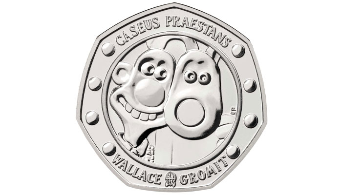
The Royal Mint Wallace and Gromit 50p coin was another bucket list project. Working with the Mint was just incredible – the hands on craftsmanship of the team there was really unique. To see a drawing go from page, to maquette, to mass produced coinage was a privilege. Also, their factory canteen lets you have half chips, half rice with the lunchtime curry.

Ha! We’ve interviewed them before and I’m disappointed that didn’t come up. Any other highlights?
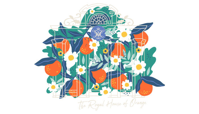
I’d have to say the recent guides for Historic Royal Palaces with The Point 1888. A really knotty problem-solving process which led to a really elegant solution.

It felt like a real team effort between United Creatives, HRP and The Point. For once, many cooks didn’t spoil the broth – all brought a little of their own seasoning. Tasty!
I also loved working on a sci-fi movie. We just went NUTS with lens flares and stardust and neon. SHEEEP IN SPAAAAACE. I think we had E.T. running on a screen in the background pretty much non-stop.
Thanks again Danny.
Enter your details to receive Brands Untapped updates & news.