—-
To stay in the loop with the latest features, news and interviews from the creative community around licensing, sign up to our weekly newsletter here


ISSHO46 director Romario Lai discusses how traditional craftsmanship, sustainability and a focus on authenticity has fuelled the firm’s latest Pantone collaboration.
Romario, it’s always great to catch up. Let’s kick off with a look at ISSHO46’s Pantone Hong Kong Collection. It’s a line centred around the collaboration between Pantone and HK Tramways. For anyone that hasn’t come across HK Tramways, what is the significance of the brand?
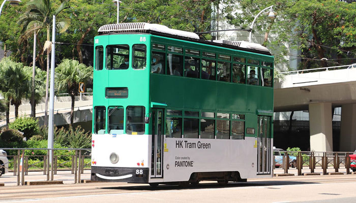
Hong Kong Tramways is the company responsible for the tram system operating on Hong Kong Island since 1904. In fact, it’s the earliest form of public transport in Hong Kong when we were still under British rule. Owing to the distinctive green colour and the “ding ding” sound it makes when it runs, the tram has not only been a collective memory for many generations of the Hong Kongers, but also an icon of Hong Kong to the world.
To celebrate HK Tramways’ newly acquired Guinness World Record of the world’s largest double-deck tram fleet still in operation, ISSHO46 – our own home and lifestyle platform – set out to line up with Pantone for the launch of an exclusive Pantone Hong Kong Collection.
The collaboration saw Pantone launch HK Tram Green… How does the colour link to HK Tramways?
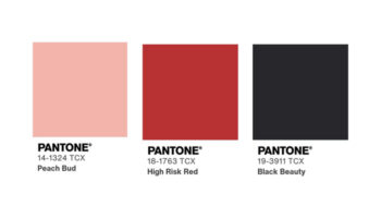
We launched a one-off colour-naming campaign with Pantone Color Institute Asia to create “HK Tram Green” which is specific to the green colour on the tramcar body.
“This Pantone collection evokes emotions and brings up memories, capturing a part of the Hong Kong culture and history.”
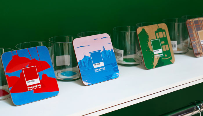
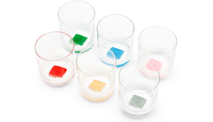
With Pantone being the brand of colours, the Hong Kong Collection of course does not just include only one colour – in fact a total of six colours were chosen to represent Hong Kong. These colours are collected from ‘artifacts’ ranging from natural ecosystem to local cultural identities. The idea is to form a diverse spectrum of colours that signifies and celebrates Hong Kong history.
So how have you translated these colours into products?
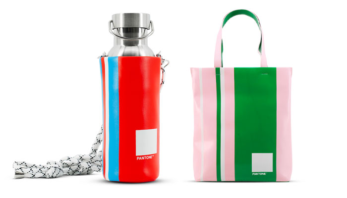
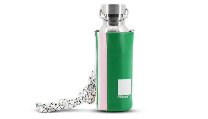
It’s a very neat and concise collection comprising of loungewear, a cup and coaster set, a thermal bottle with carrier and a tote bag. In addition to the direct visual linkage to the colors’ respective origin, we’ve also tried to embody a deeper meaning in the product itself. The design team investigated the possibility of incorporating traditional craftsmanship and cultural symbols that are part of Hong Kong’s heritage in the design and the production.
Interesting. Could you give us an example?
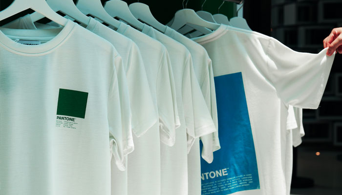
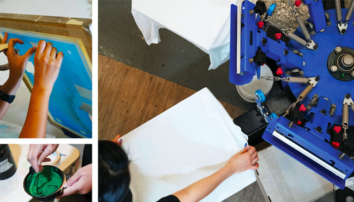
Yes. The colour prints on the t-shirts are created by bringing together two kinds of traditional printing techniques – rubber stamp print is first used to create the pattern with distinctive texture, which is then made into a light-sensitive film for silk-screen printing by hand. This is all made possible locally in Hong Kong by our own production line, Alliance Printing & Manufacturing Co. Ltd, which started as a printing mill in 1968.
The glass cups are mouth-blown by artisans with traditional glassmaking technique before applying the colour chip decals at the bottom. The production of the coasters, on the other hand, includes a procedure that utilises wood-engraving techniques to create the reversed illustration. It is then used to translate into the graphic prints on the coasters which depict the origins of the respective colours.
Impressive stuff! And does this authentic approach extend to the entire rage?
The design of the thermal bottle carriers and the tote bags is a nod to the Hong Kong style red-white-blue bag. To those who are not familiar with it, it is a typical household carriage bag made out of nylon canvas. It originated in Hong Kong in the 1960s and has become a representative of Hong Kong pop culture due to its mass usage. With a modern twist, the design team combines colours selected in the collection to create our own version of the classic pattern.
“Not only does the collection offer products that are sustainable, the design also revives traditional craftsmanship that involves local artisans and manufacturers.”
This is our approach to bringing the colours and Pantone brand to life in consumer products – by linking colours with cultural icons and giving a spotlight on the traditional craftsmanship which allows an underlying narrative from the production level. This Pantone collection thus evokes emotions and brings up memories, capturing a part of the Hong Kong culture and history.
Absolutely. Sustainability is also a key element of this collection. Talk us through what you’ve done with regards to keeping things eco-friendly?
A fun fact is that the tram was actually the first electric transportation in Hong Kong. Although back in the day being eco-friendly was not a thing, in today’s context going green is what we are aiming for – and Hong Kong Tramways is proud of having the long history of being electric and sustainable. This is also why we believe that bringing in sustainability would be a great idea for the collection – after all, it is a global trend as well!
How easy was it to keep the range sustainable?
It was certainly a challenge, but we were lucky to have Alliance Printing as our production backup. As a printing and fabric mill for decades, Alliance Printing is capable of sustainable fabric development. The t-shirt fabric is made of 100% RPET – recycled plastic. Modern technology mechanically breaks down recycled plastics into tiny flakes, which are then melted down to be spun into yarn, producing a sustainable yet comfortable fabric.
The carrier of the thermal bottle and the tote bag are also sustainable. The key material is eco-leather – a recycled leather material that utilises responsibly sourced leather off-cuts to fuse into durable leather sheets. The material does not only give a high-grade genuine leather feel, but also reduces wastage of raw materials, which is a huge problem of today’s mass production scene. The full cycle of the product, from production through its lifetime to final disposal, is therefore able to reduce total carbon footprint.
What we are trying to present with the Pantone Hong Kong Collection is a progressive narrative that builds upon the idea of sustainability and conservation… Not only does the collection offer products that are made of sustainable and recycled materials, the way the design came along also revives traditional craftsmanship that involves local artisans and manufacturers. The Hong Kong Collection creates a dialogue that establishes a linkage between the past and the future, promoting the idea of “preserving Hong Kong” for both the natural environment and its culture.
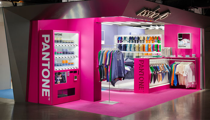
At our last interview, we spoke about your work on a Pantone pop-up shop – and you’ve done another one! Talk us through the design of this Pantone corner.
The Pantone themed corner, which we call the “Pantone Color Hub”, is situated in ISSHO46 Hong Kong flagship store in K11 Musea, an upscale shopping mall gathering both the trendy and the luxury crowd. In fact, it’s just next to the famous MOMA Design Store!
The challenge here is to stand out among all the high-end designer boutiques, while keeping up with the trendy, futuristic elements within the context of the mall interior. Luckily, Pantone’s branding materials allow designers much flexibility to experiment with.
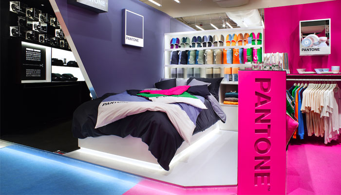
The team at White Studios, the design house responsible for the interior architecture of this project, put their creativity on visual communication through sculpting spatial atmosphere. We believe that light and colours exist side by side, and always complement each other. They become the key visual elements that shape the area.
Shocking pink is used to wrap the whole shop front so that it gives an immediate visual impact, helping it to stand out from a far. A combination of repetitive, directional lighting design and mirrors that help alter ordinary visual planes creates a futuristic and techno-styled look, which helps establish a bridge between the bright colour of the area and the cool metallic finish of the mall.
“It would be interesting to see if we can have exclusive collections around the world that are based on the culture of respective cities.”
The Pantone Color Hub is arranged into several semi-enclosed spaces with a combination of raised platform and angular division. This is to enhance the shopping experience by providing display layering and hierarchy, creating a variety of “moments” along the route into the shop. A nice touch by the design team is a tailor-made PANTONE vending machine that adds to the surreal atmosphere in this dreamy colourful corner.
Before we wrap things up, what does the rest of the year have in store for you guys?
Covid is hitting the world hard, and of course here in Hong Kong is no exception. But on the bright side, ISSHO46 still has plenty of new and interesting things going on at the moment. For instance, we are planning ahead to see if we can take our collaboration with Hong Kong Tramways further and, when things calm a bit, we can perhaps launch a special Pantone pop-up on one of their tramcars where we can gather a few more partnering brands for an experiential retail event.
That sounds amazing. And are there any plans to bring your collections to the UK, or any other markets?
Internationally, we are also looking for overseas opportunities for our Pantone collection and it would be interesting to see if we can have exclusive collections around the world that are based on the culture of respective city, just like what we did with the Hong Kong Collection.
Yes, maybe the team at Transport for London are reading! On that, are there plans for other brand collaborations in the pipeline for ISSHO46?
Apart from Pantone, we are working with a few up-and-coming brands that we see much potential in. WHITEGOODS, which has its own feature area in our flagship, is one of them. Co-founded by a Japanese product designer and a British architect, WHITEGOODS is a design studio that focuses on function and quality.
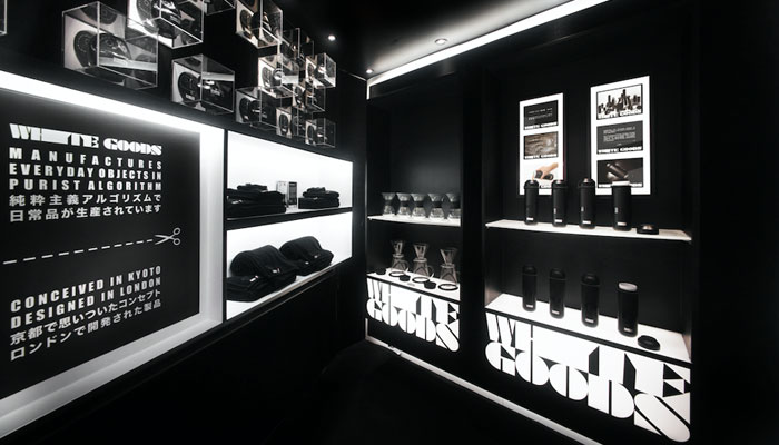
We find this brand interesting because it is like a clever fusion dish – taking the traditional Japanese Zen culture as a base and approaching it with modernised design strategy that suits within today’s context.
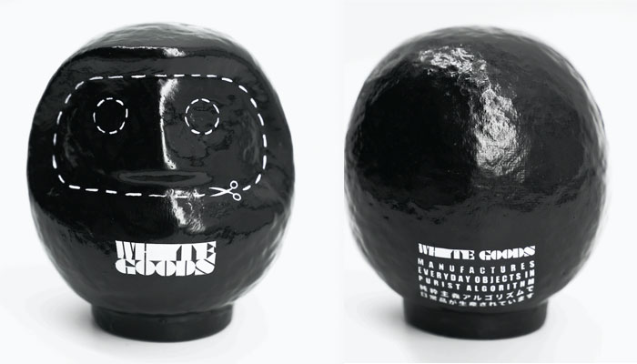
They dare to turn away from the common white-box minimalism and choose to confront life and daily objects with purism in absolute blackness. They have this redesigned black Daruma doll handmade in Japan as the brand icon which is weirdly attractive – almost like a cult – and we love it!
We believe that going forward the consumer market needs more inputs that take references from and eventually celebrates the culture, the history and the story of the people, or a place. So, if there are any brands, companies, boutiques, or individuals out there hoping for collaboration – or simply having something good to share – ISSHO46 is totally open to talk about it and we are eager to make things happen – to keep this world moving.
Great stuff, hopefully some people will get in touch! Thanks again Romario, and hope the Pantone Hong Kong collection continues to enjoy success.

How did the Instagram account A Daily Cloud became a board game? Inventor Tim Walsh tells all.

Jon Morgan – Creative Director at CAA Brand Management – on the agency’s newly launched consultancy service… And what fuels his creativity.

As Toy Story celebrates its 30th anniversary, Pixar’s Creative Director for Consumer Products, Jen Tan, talks new style guides and fresh launches.

Meredith Counts, VP of Creative, on Jewel’s Creative Service division – and how it can help retailers, brand owners and manufacturers in uncertain times…

Regan Deason – Project Manager and Producer at Goliath – on bringing iconic video game brand The Sims to the tabletop.

“I realised early on that HAL was going to be pretty fun to play”: Game designer Phil Walker-Harding takes us inside development of Maestro Media’s 2001: A Space Odyssey: The Board Game.


Enter your details to receive Brands Untapped updates & news.