—-
To stay in the loop with the latest features, news and interviews from the creative community around licensing, sign up to our weekly newsletter here


To find out more about what went into bringing Pantone to life as a retail experience, we caught up with Issho46 Director Romario Lai.
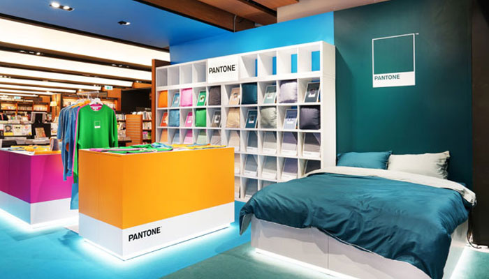
Last month saw Pantone team up with lifestyle retailer Issho46 to launch a store – the Pantone Lifestyle Gallery – within the Eslite bookshop at Hong Kong’s Cityplaza.
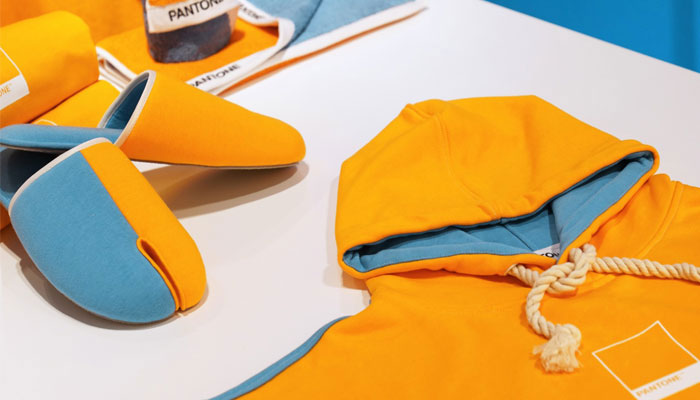
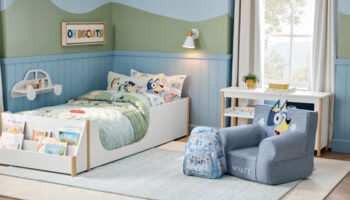
The eye-catching 600sq ft location sells a range of Pantone products, including the FunMix collection spanning bedlinen, loungewear, slippers, towels, and blankets – and a limited-edition tablewear range.
To find out more about what went into bringing Pantone to life as a retail experience, we caught up with Issho46 Director Romario Lai.
Hi Romario; great to connect! First up, Issho46 – what’s the meaning behind the name?
‘ISSHO’ means ‘a lifetime’ in Japanese; while ‘46’ indicates the percentage, according to research, of a life that an average person would have spent staying at home. We dedicate so much time to being at home, so we need to respect that time and make it worthwhile. Inspired by Japanese culture of respecting and accrediting life and home, Issho46 is dedicated to curating home and lifestyle products that speak for uniqueness, quality, well-being and character.
It’s a stat that makes total sense but is also a bit of an eye opener! Before we dive into the Issho46 brand and its Pantone collaboration, how did you find yourself in this line of work?
I studied in UCL at the Bartlett School of Architecture and had also worked in several architectural design firms before I joined Alliance Printing & Manufacturing Co. – the parent company of Issho46 – because I didn’t want to just work in architecture.
Alliance was initially a manufacturer of fabric dying and printing in Hong Kong, founded in 1968, which found itself a position in the home and lifestyle licensing industry in 2000. The company offered me an extended platform where I could further apply my creativity in different realms.
So, is Issho46 a brand in its own right as well?
Issho46 is a brand itself but it is more of an alter ego for Alliance Printing. Alliance Printing is a very industrial-sounding name. It doesn’t sound like a brand, or even a retailer! Issho46 is the identity for our direct-to-retail business, as well as our upcoming ecommerce platform.
Great. You mentioned there that Alliance started off in fabric dying and printing. What led the company to get involved with brands?
From 2000, we started working with ESPRIT as a licensee for bed and bath and we still work with them in the home and lifestyle area. We like to work long-term with brands, with partnerships that span years. We treat these partnerships as if they were our own brands, and that also extends to what we’re trying to work out with Pantone now.
Yes, on that, how did this Pantone partnership come about?
In the home and lifestyle category, we mainly work on bedlinen projects. There has always been a huge demand in plain solid colour designs. However, with the brands we have worked with before, it’s often been quite unsuccessful, in my opinion, to come up with a nice solid colour addition to an otherwise pattern-dominated collection. The fact that solid colour designs are sometimes deemed as an ‘addition’ or ‘side range’ is one of the reasons why these additions are not doing the job.
Another huge factor, I believe, is the lack of connection between these solid colour products and the brand context. Pantone being the world library of all colours and the expert in colours meant that intuitively it was a perfect match with any solid colour products. We approached Pantone and it all developed from there.
What did those first few creative steps look like when working with Pantone?
There are almost unlimited opportunities with the Pantone brand. It’s focused on colour and everything needs to relate to colour, and how colour connects with emotions. This was key to our team deciding what we could do with the brand.
We also like to look at the histories and ideologies of brands, and that helps shape what we want to do. You have to have a story to tell. It helps for the design, but it also helps when it comes to the retail environment. You want a story to tell there too, and everything should link back to the brand context.
You’re telling quite a story with your Pantone store – the Pantone Lifestyle Gallery. It looks superb. What guided your design of the store?
It was a collaboration between Alliance Printing and White Studios – an artist collective I founded with a few other creative minds. White Studios was responsible for the architectural design and the marketing campaign. A lot of it harked back to my architectural exposure. When we designed it, we looked at the context of the store and the Pantone Lifestyle Gallery is actually its own space within a large bookstore called Eslite.
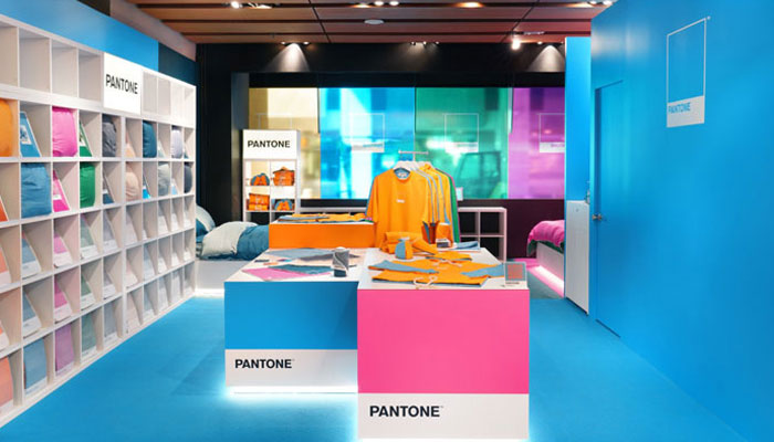
We knew we had to create a casual, welcoming environment, so it had to be spacious. We didn’t want to cram it full of product. Some traditional retail environments try to show off all their merchandise because of a belief that they need a certain amount of product per square feet to sustain business. However, if you look at high-end shops, they don’t do that. They realise that space is very important in generating a welcoming retail atmosphere for customers to shop, and that’s our main concern. We didn’t want to disturb the comfortable atmosphere that the Eslite bookstore already has.
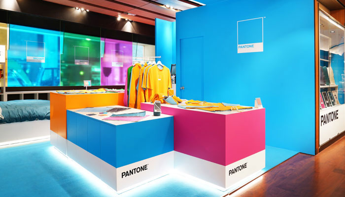
We then looked at how bookstores are usually laid out, and this led us to look at zoning within libraries. Each genre of book has its own zone at a bookstore, so we thought about doing zoning with colours. Also, by having a zone dedicated to one colour, it can have a real visual impact. This set the key concept for the store design.
Were there key hurdles to overcome with the space?
The main architectural material of the bookstore is wood and dark greyish metal. Both contradict with colours – and with Pantone. Pantone is about colour, it’s not about wood and natural texture. We ended up wrapping the whole area in colour, and we even wrapped the ceiling, so the blue area has blue carpet, a blue sideboard and a blue ceiling.
The same week we covered the Pantone Lifestyle Gallery, we also covered the Harry Potter store in New York and the Corona pop-up stores in Mexico. Do you think we’ll see more brands embrace these kinds of creative retail executions moving forward?
I think so. We didn’t start this trend, but we are following it. Pop-up shops are interesting for both retailers and customers. The public get to see something different and limited, so you feel you have to come in or you’ll miss it!
For the retailers and the brands, it provides a creative shopping experience where you can showcase something more about the brand and the specific collection, as opposed to the usual retail-oriented environment. We’re actually planning with some retailers and venue providers at the moment for future pop-up experiences under Issho46 and Pantone.
We’ll keep an eye out for those. Now, we should talk about the product you’ve created for Pantone too. Why does Pantone work so well in bedding?
Well first, I have to mention Copenhagen Design – the design company behind a lot of Pantone hardware products, like mugs, notepads and umbrellas. They’ve done a great job already, and some customers know their Pantone products, so that helps a lot.
Pantone transitions to consumer products better than a lot of other brands, and it has a strong relation to fashion trends and fashion colours, as well as home trends and home colours. That makes it a good brand to do home and lifestyle products and home textile is one strong category not to miss.
We’re actually designing our second and third collections with Pantone right now, and they’ll be very different from the first. The second will be a small capsule focused on colours that are specific to Hong Kong. For this, we are partnering with Hong Kong’s most iconic public transport that was established in 1904 and we want to focus on culture, history and identity in relation to colours. Sustainability is also a key ingredient. To link all these together, the team is able to come up with a way to present the colour that creates a unique design language that speaks for the collection.
That sounds exciting! Before I let you, looking ahead, what other sorts of brands are you looking to collaborate with?
We’re very open, as long as the brand has a story to tell. Whether it’s a new brand, an old brand or a brand that’s – on paper – completely unrelated to the home and lifestyle space, we’re open to collaboration.
Great stuff. A huge thanks again Romario for making the time! Good luck with the rest of your Pantone launches.

“A gentle moral, a touch of humour, and a lot of heart…” Emma Soames talks all things Cabbage and Tyler.

Bex Coster talks us through the creation of Positive Potato and recent brand extensions with PMS.

“From IP to impact”: Brad Page on crafting immersive brand worlds through merchandise, marketing and digital design.

“With it being Wild’s first character licensing deal, it’s been special”: Grace Tedstone, Licensing Brand Manager at Wild, talks us through the company’s licensing strategy for this year and beyond.

How did the Instagram account A Daily Cloud became a board game? Inventor Tim Walsh tells all.

Jon Morgan – Creative Director at CAA Brand Management – on the agency’s newly launched consultancy service… And what fuels his creativity.


Enter your details to receive Brands Untapped updates & news.