—-
To stay in the loop with the latest features, news and interviews from the creative community around licensing, sign up to our weekly newsletter here
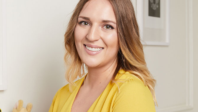
Bridie Gibbs – Product Development Executive at Magic Light Pictures – tells us why Room on the Broom has soared when it comes to brand extensions.
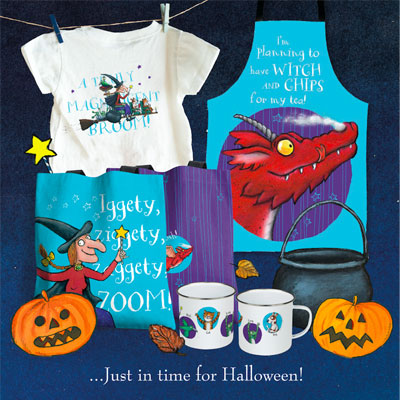
To celebrate 20 years of Room on the Broom, Magic Light Pictures has launched a new Halloween-inspired range of products.
The entire collection – which spans t-shirts, tote bags and aprons – was designed in-house by Bridie Gibbs, Product Development Executive at Magic Light Pictures.
We caught up with Bridie to find out more about the design process behind the range – and why Room on the Broom has soared when it comes to brand extensions.
Bridie, great to connect! Before we dive into Room on the Broom, how did you come to be working in product development?
I have always been a creative person with a strong interest in design, so after deciding university wasn’t for me, I started to look for my first creative job role in London.
In 2015 I began working at Santoro Ltd as a Product Development Assistant on their licensing team – to be honest I’d never even heard of licensing or product development at this point, but I soon fell in love with it and it became something I’m really passionate about!
“Where possible I feel it’s important to create synergy between the design and function of a product.”
Great stuff. You recently designed a new Halloween Room on the Broom collection. Talk us through your first creative steps in putting that range together?
I wanted to design something that felt very gender-neutral, so I really considered this with the colour palette I used. I chose to include purple so the range felt seasonal and Halloween-y, combined with the bright blue to create a fabulous contrast that really accentuated the other design features.
I felt it was important to make use of all of the characters in the story and not only focus on Witch – and of course to include phrases from the book to draw people back to the original narrative.
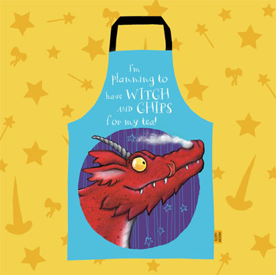
I also created a bespoke pattern which could be used across a few of the products in the range to tie everything together. Where possible I feel it’s important to create synergy between the design and function of a product; I think that’s why I love the Dragon apron so much – it’s the perfect attire when cooking up your Witch and Chips for tea!
I can’t argue with that! The collection also celebrates 20 years since the launch of the book. What is it about Room on the Broom that has ensured it’s still thriving today?
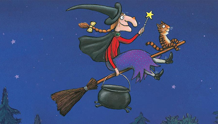
Julia’s writing and Axel’s illustrations manage to portray so much personality for each of the characters in just a few pages, making them very relatable to children. The story builds up such excitement as each new animal is introduced and add to the narrative in their own way. Room on the Broom is also a tale of spells and potions, so children are of course excited by this new magical world they’ve discovered.
20 years on, there is now a sense of nostalgia around the book; older children, parents and grandparents are able to introduce it to the little ones in their lives and enjoy watching them fall in love with it too.
On that, there’s plenty of beloved kids’ books that don’t make the successful leap to licensing. Why do you think Room on the Broom has proven to be a good fit for brand extensions?
It is a lovable story which resonates with children in many different ways; however, it has also benefited from a steady approach to licensing and being nurtured along the way. The book, published by Macmillan Children’s Books, had existing popularity to begin with, and Magic Light’s animated special grew the fan base even more.
Naturally people wanted to interact with the story in more ways, so then came the merchandise, activity trails and even an attraction at Chessington World of Adventures Resort.
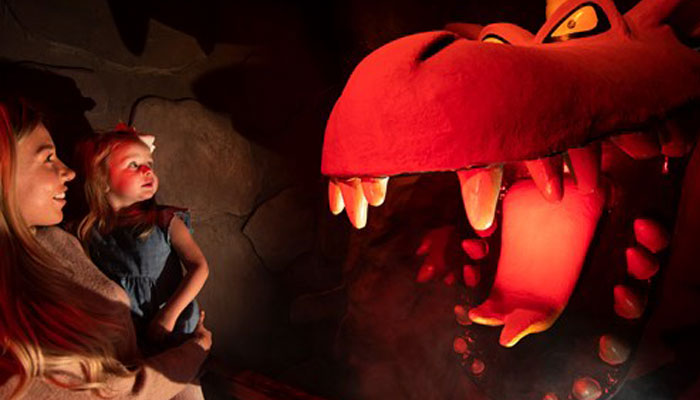
When developing merchandise for a property like Room on the Broom it is important that the book and narrative are the focal point of the product. I think it’s this authenticity that people love.
You’re the Product Development Executive at Magic Light Pictures, so from a design point of view, what makes Room on the Broom great to design for?
I love how the characters are so varied. Their differences in size, colour and also the energy they bring to the story all help to create a visually exciting design.
In Room on the Broom especially, I find Axel’s illustrations to be super expressive, and there is lots of fun, joyful imagery throughout that translates so well onto product. Julia’s imaginative and playful rhymes are great fun to work with – the Witch’s spell for example, “Iggety, Ziggety, Zaggety, ZOOM!” is just perfect!
I’ve just turned into a broom so it’s probably best we wrap things up. One last question; what do you do to help fuel your creativity?
I am lucky to work in an industry which is extremely vibrant, creative and ever-evolving, which is always inspiring to me.
In my personal life I like to make sure I am keeping the creative juices flowing by working on my own artwork at the studio I rent. When starting a new project, I like to quickly get all of my initial ideas out on Photoshop and start deciding which to develop further – then of course boil the kettle, play some music, and get in the zone!
Great stuff. A huge thanks for taking time out for this Bridie. Let’s catch up again soon!
Enter your details to receive Brands Untapped updates & news.