—-
To stay in the loop with the latest features, news and interviews from the creative community around licensing, sign up to our weekly newsletter here

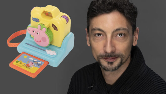
HTI’s Marco Moroso talks us through the firm’s PEPPA PIG range – and how it involved ‘reversed cubism’!
Marco, thanks for making time to chat. PEPPA PIG celebrates its 20th anniversary this year. Why do you feel the brand has resonated to such a degree with kids – and parents – over the years?
Simplicity – as in ‘friendly, accessible yet entertaining content’ – is the key driver of PEPPA’s continuous success. Peppa’s underlying human values are timeless, meaning they can endure changes in society, trends, and consumer habits. PEPPA combines humour and education in a way that appeals to both parents and children alike.
Not all hit kids’ TV shows replicate that success in the toy aisle. What do you feel the brand lends itself to the role-play category?
Consumers tend to buy product they feel connected to. Beyond the inherent value of the product itself, consumers perceive other subtle yet significant layers of content that ultimately determine the success or failure of a product once it’s on the shelf. We make it a priority to maintain Peppa’s core values in every product we design.

On that, what makes PEPPA an exciting IP to create for?
Working with PEPPA is an exciting challenge because of its seemingly simple nature. Achieving the right forms, colour balance, and playful essence while staying true to PEPPA’s unique feel can be tricky. However, this challenge makes our creative journey incredibly engaging and rewarding.
“We value ‘simplicity’ and that’s what drives us forward.”
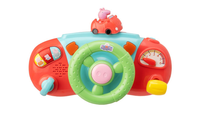
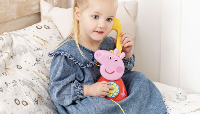
Can you talk us through a few stand-out products from the range, and the design-thinking behind them? Your Peppa’s Telephone gets a lot of airtime in my house! It gets more calls than my phone!
I’m thrilled to hear that you enjoy our Peppa Telephone! It was indeed a challenging product to design. Imagine transforming your favourite character into a telephone, with all the complexities that come with it. We had to ensure that it didn’t look odd or out of place. Getting the proportions and colours just right was crucial for its aesthetics. Additionally, we wanted to create something simple yet playful, instantly recognisable as Peppa.

Our design philosophy is based on the idea that appealing to all five senses is essential to create something truly enjoyable. Knowing that Peppa’s Telephone is getting more use than your own phone, perhaps it’s time for us to explore the idea of a Peppa Mobile just for you!
“Working with PEPPA is an exciting challenge because of its seemingly simple nature.”
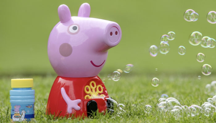
Ha! Sold! Your PEPPA PIG bubble machine also looks great. What was that process bringing a 2D character to life in 3D?
It required us to think outside the box. We had to use what I call ‘reversed cubism’ to maintain Peppa’s iconic traits while adapting them to our three-dimensional world.
Sounds tough.
It wasn’t easy, and we had to create multiple mock-ups to find the best balance in terms of shape, elements, and mechanical constraints. We’re pleased with the outcome so far, but we’re always striving for improvement.

Marco, this has been fascinating. One last question: What fuels your creativity?
We value ‘simplicity’ and that’s what drives us forward: there’s always something new to look at, every day. By looking at things from different perspectives, we discover new opportunities and avoid feeling stuck in a routine. It’s on us as designers to find out and bring the ‘newness’ in what we create, but we also have a mission – a very important one: to bring joy to children. Sounds ‘simple’, and we’d love it to be, but it’s not and this constant challenge keeps us going and pushes us to improve and grow.
Great stuff. Thanks again.
Enter your details to receive Brands Untapped updates & news.