—-
To stay in the loop with the latest features, news and interviews from the creative community around licensing, sign up to our weekly newsletter here

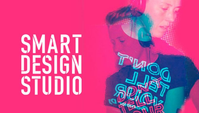
Smart Design Studio’s Nic Davies discusses her ‘slowing down to speed up’ approach to projects.
Nic, it’s great to catch up. Could you give us a quick potted history of your career and the story behind Smart Design Studio?
I was reminded recently that, as a child, my answer to the question ‘What would you like to do when you grow up?’ was that I wanted to design confectionery packaging… You can imagine my excitement as a 23-year-old just out of Graphic Design College when I landed a job with the BonBon Buddies.
This was my first step into the licensing world, and a place I’ve felt right at home in ever since. I worked for some great companies across many product categories, first as Designer and then Art Director – from greeting cards to publishing and almost everything in-between. I now spend my days running my own design business – Smart Design Studio – here in Bristol.
Can you give us an idea of the sort of design work you undertake in the licensing space?
There are two sides to Smart Design Studio. First is me, the graphic designer. I do a lot of work in the publishing world; mainly licensing, mainly kids and young adult.
Also, having worked with character style guides for over 20 years, it was a natural progression for me to also get involved with the creation of style guides too – the most recent one being for the CBeebies smash-hit, Alphablocks.
My clients are recurring, and I’m often looked on as an extension to their business or design team. I work with them on a whole range of projects, from sales pitches and marketing tools to products, gifting, and style guides.
And the second side?
Well, when needed, I expand the Smart Design team and operate as a packager on larger publishing projects, where we take on editorial as well as design. At times we work on big series over short periods of time… We love a good movie tie-in!
How do you keep yourself on trend and in touch with design developments in licensing?
Social media and looking online I’d have to say. I think over the last few years, I’ve got used to doing it this way. I have my morning ritual where I spend the first part catching up on new licensing and pop culture news – sometimes longer if I get side tracked down a design rabbit hole and I’ve had one too many coffees!
I make notes and have a digital scrapbook that’s constantly on the go 24/7 which acts as inspiration for future design projects. I regularly catch up with friends in the licensing world too. It’s good to chat and share and see what everyone is up to.
Given the breadth of the licensing world, how easy is it to design for a range of product categories?
I certainly have my specialised areas, but I do also move around categories quite a lot. I think the key is to take time to understand the brand you’re working with and what its core brand values are. Keeping on top of current trends in pop culture – and having that genuine interest in what’s going on in the licensing industry – means you build that product knowledge naturally on a daily basis.
“Over the past few years, I’m doing more and more projects where we are ‘reinventing’ older brands or ‘retelling’ stories for new audiences.”
When there are time pressures on a project, it’s all too easy to jump in quickly… I’m a big advocate of the work ethic ‘slow down to speed up’ and always make sure projects are approached in this way with clients to ensure they are delivered on brief and often ahead of deadlines.
Over the last five years, what have been the biggest changes you have seen in design work for the licensing industry?
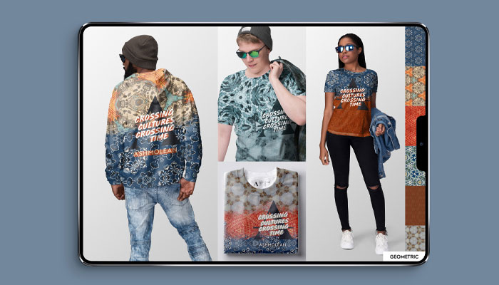
There’s been a few areas I’ve noticed changes. Over the past few years, I’m definitely doing more and more projects where we are ‘reinventing’ older brands or ‘retelling’ stories for new audiences. I’ve recently completed a project looking at new ways to bring the artifacts from the Ashmolean Museum together with the museum itself to visually reach a new audience.
Another area that publishing for sure has worked hard to address is inclusivity and empowerment, especially for the younger audiences. We’ve worked on a lot of Barbie publishing projects over the last 18 months and this brand does so well to empower its audience and be fully inclusive.
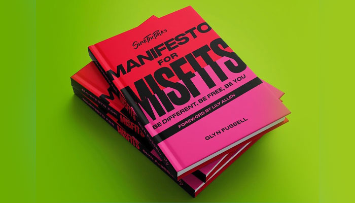
There is much more choice and openness now when you look through the bookstores when it comes to topics that weren’t always represented. It’s so good to see mainstream publishers publishing books like ‘Manifesto for Misfits’ by Sink the Pink. Good work Quarto!
Sticking with the publishing category, what are some of the trends within the sector that are influencing your design work?
Designing in the publishing category, and especially thinking about the cover design, you have such a small snippet of time to grab someone’s attention to get them to pick the book up from the shelf…
I’ve seen a trend of very bold cover designs with very direct messages – I have to mention Manifesto for Misfits again! – that have a lot of impact on shelf. It’s something I definitely had in the forefront of my mind while working on Cathy Press’ new book When Love Bites.
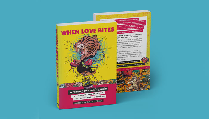
The thinking behind the cover design was to speak directly boldly and confidently to the young audience to empower them and with a ‘tone of voice’ visually that they were familiar with. Cathy’s book addresses the sensitive subject matter of teenage relationship abuse, so this bold approach was always going to be a challenge to get the balance and ‘tone of voice’ right for these young adults.
In licensing in general, there’s a real trend to collaborate. It’s been about for a while, but we are seeing more and more of it. Personally, I love a collaboration and find the product that comes out of it very exciting. Maybe it’s because it has that ‘one off’ vibe and I’m a sucker for collecting things!
Are there lessons that licensing could be picking up from other industry sectors design-wise?
The directness, the instant-ness – if that’s a word! – of the publishing world in terms of cover design. I think especially with the young adult audience and the amount of content that’s available to them these days, it can be a challenge to stand out and often you only have that split second to do it.
When you are set design briefs, are there some key points you look for?
Absolutely, and if they are not there then I’m going to ask questions to find out!
‘Tone of Voice and ‘emotive’ are the main things I look for, and the main things I focus on if I’m briefing out. I want to know what emotion we want the person to feel when they pick up the product, and what ‘design voice’ we want to use to make that happen.
Nic, this has been great! Before I let you go, what are your three most recent purchases that feature licensed properties and designs?
Disney Mickey Mouse Happy Socks. Sink The Pink’s Manifest for Misfits – did I mention this book yet! And I’ve just seen the PAC-MAN X Eastpak collaboration… I’m pretty sure the PAC-MAN pouch is going to be my next ‘recent purchase’ by the time you read this!
Yes, that range is great isn’t it. Thanks again Nic!

Formitalia Chairman David Overi on designing items that represent the Bruce Wayne style in a subtle way.
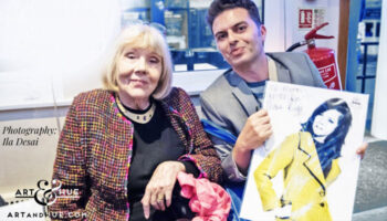
With the 10th anniversary of Art & Hue approaching, Odysseas Constantine tells us how he approached creating pop art pieces for an eclectic raft of brands.

From Kingsman and Churchill to The Ashmolean and more: Alastair Adams on Conway Stewart pens.
From James Brown to Whitney Houston… Norman Perry – President of Perryscope Productions – talks creativity, design and the importance of ‘the first DJ’.

Tottenham Hotspur’s Head of Licensing discusses what makes the club an extraordinary partner.
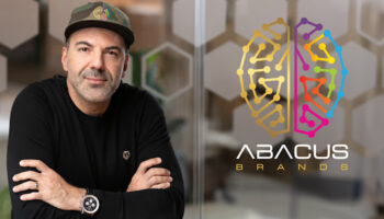
How Penn & Teller’s licensing deal with Abacus Brands uses the magic of Virtual Reality


Enter your details to receive Brands Untapped updates & news.