—-
To stay in the loop with the latest features, news and interviews from the creative community around licensing, sign up to our weekly newsletter here
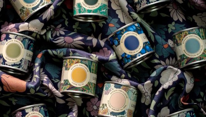
Start Licensing’s Ian Downes shines a spotlight on a partnership between Farrow & Ball and Liberty around a curated paint collection.
Farrow & Ball is a company I’ve always been impressed by. Indeed, I have a lot of Farrow & Ball paint on my walls at home. It’s a brand that has enjoyed a lot of success and has a high profile within the home decoration sector, but one that has managed to build awareness beyond its core market. This has been in large part I think due to the careful curation of their own brand, their communications programme and, of course, the quality of their product.
Recently they let the TV cameras into their business. The resulting documentary, Inside The Posh Paint Factory, is a fascinating watch giving a great insight into the company’s operation and approach to paint-making. One aspect that was particularly interesting was the process of coming up with names for their paint, although – spoiler alert – the Farrow & Ball team chose not to reveal the story behind the naming of the Elephant’s Breath paint.
During the documentary there was reference to Farrow & Ball’s licensing partnership with the Natural History Museum. They have developed a Colour by Nature collection together.
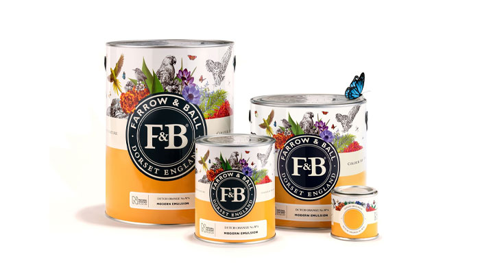
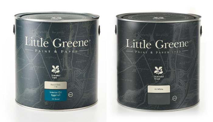
Further back into Farrow & Ball’s history, The National Trust has been a key feature of their development and they have worked closely with the heritage brand, although the current licensee for National Trust paints is Little Greene.
The TV programme made the point that the (stiff)key to Farrow & Ball’s success has been their involvement in the world of heritage and an appreciation of heritage – something their earlier links with the National Trust helped nurture. Clearly licensing and partnerships can help underpin this further. So, I guess it was no surprise to see Farrow & Ball launch a new collection recently in conjunction with Liberty.
I spotted the collection in my local branch of Brewers Decorator Centres. My eye was drawn to a well-presented window display featuring the collection and this was a reminder of the care that Farrow & Ball take to present their product at retail. Of course, in this case, this would have been developed in conjunction with Liberty, a company who know a thing or two about the long-term curation of a brand themselves.
Liberty is well known for its prints, fabrics and design. It was founded in 1875 and has an illustrious history. Liberty have also often dipped into the world of licensing with a range of products and partnerships over the years.
This partnership is described as an ‘edit’. It brings together paint colours from Farrow & Ball and Liberty Interior Fabrics from the Modern Collector range. As noted by the range’s colour card, ‘These colours and prints create a timeless series that pays homage to each brand’s archive.’
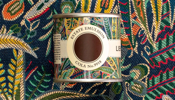
The partnership is pitched I think to help inspire consumers and to give them fresh inspiration in terms of interior decorating with a focus on combining colour and print around the room. An edit also conveys a sense of confidence. Farrow & Ball place a heavy emphasis on their product and category knowledge.
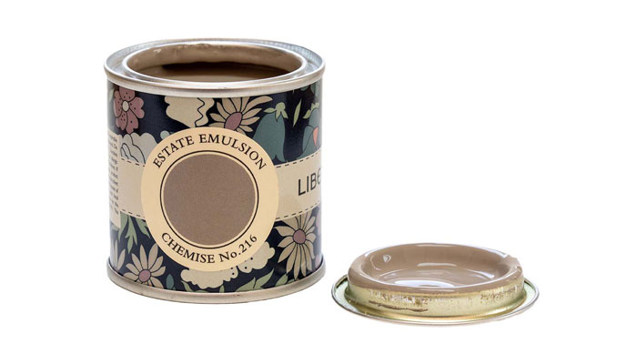
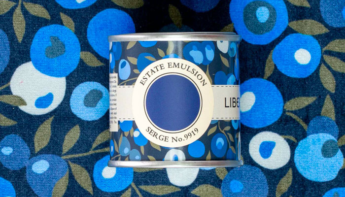
There are a series of sample pots of signature Farrow & Ball colours decorated with three patterns from the Modern Collector Range of Liberty Interiors Fabrics: Persian Voyage, Poppy Meadowfield and Wiltshire Blossom. The pots make quite a visual impression and a great showcase for the Liberty patterns. The edit features 15 shades from the Farrow & Ball Archive collection and these are matched with complementary interior fabrics from Liberty.
Suggestions and combinations include Farrow & Ball Olive coupled with Liberty’s Poppy Meadowfield Pewter Blue and Farrow & Ball’s Pantalon matched with Liberty’s Wiltshire Blossom Lapis Dark. It is a very creative and imaginative partnership that plays to each brand’s strength and of course heritage.
To help guide consumers and double up on inspiration, the partnership is underpinned with a plentiful supply of location photography which has been featured in magazines and across social media.
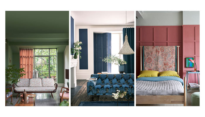
Partnerships like this are ones that help create media interest and arguably this is part of the rationale for developing edits like this. It also helps both brands reinforce their brand heritage and stories.
Joa Studholme, Farrow & Ball’s colour curator picked up on this point, stating: “Each of our Archive colours is greatly treasured – many customers consider them hidden jewels, which makes them very appealing. Others take comfort in knowing that a favourite colour used to decorate one’s home years ago is still readily available today. Each one is as loved now as when it was first created.”
Likewise, for Liberty this is an exciting way of reinforcing their credentials and from a practical point of view, shines a light on some of their classic patterns. It is a really great example of two well-known and successful brands collaborating in a progressive way. By working together, both brands are achieving great impact in the market.
Enter your details to receive Brands Untapped updates & news.