—-
To stay in the loop with the latest features, news and interviews from the creative community around licensing, sign up to our weekly newsletter here

Paula Ford, Creative Director at Hype, on why simplicity is the key when it comes to licensed card design.
Hi Paula. Can you give us some background to the history and development of Hype, and how you alighted on the world of greetings cards?
We started in the recession of 1991. I had been made redundant and Richard was working as a marketing consultant. On behalf of another company, Richard started discussing – with Copyright Promotions – a greeting card licence for Spitting Image. The other company didn’t want to pursue this opportunity, so we decided to do it ourselves, launching the cards at the first ever Autumn Fair in July 1991. The following year we approached Warner Bros and added the Looney Tunes licence, and the company grew from there!
Your products largely feature licensed characters and brands, and you seem to focus on classic and evergreen characters. How do you choose which brands to work with?
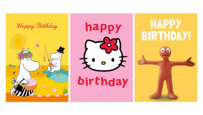
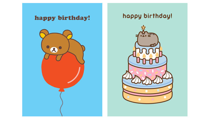
We don’t have a formula for evaluating possible licences. I generally decide which ones I think are attractive and could work on greeting cards and our other products. We like to seek out opportunities which have not yet been embraced, as well as working with more established licences. We are often early adopters of licensed characters… For example with Hello Kitty in the 1990s, with Pusheen a few years ago, or last year with Rilakkuma. We remain very open minded about possible licences, sometimes returning to things we previously ruled out.
What can change your mind?
There’s sometimes a feeling that the time is now right for a property, or we’ve come up with an approach that we think will be strong.
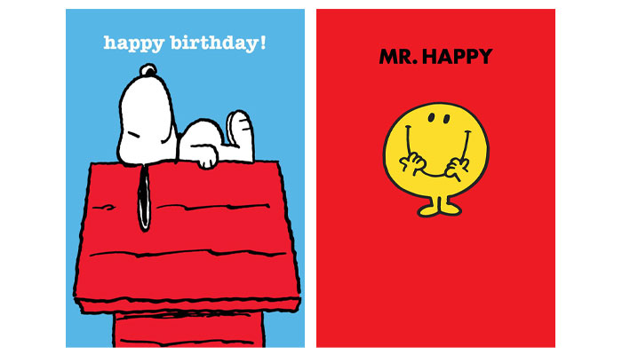
A good example is Mr Men, which we first signed the licence for in the early Nineties. We loved the books and the original art by Roger Hargreaves, but just couldn’t visualise a great approach for use on cards… One day, I was in a bookshop and looked at the rack of Mr Men books and realised that the book covers were the key. We launched our range of very bold simple designs with just the character title and a character illustration – and they were an immediate hit!
Great example. Now, Hype cards have a very distinctive design style; they’re really recognisable. Was this a deliberate ploy? And how do you maintain this look across the brands you work with?
Our house design style is not a conscious decision, but it comes from my search for the essence of each licence and for beauty – which often lies in simplicity. My original training in architecture – where ‘less is more’ – is probably a reason for this way of seeing things.
Most card publishers have a recognisable style because of their individual creative approach, and it seems that we have ended up with the same distinctiveness – even though we are designing using characters and art that we have not created.
Can you talk us through your creative process when develop a licensed card collection?
We start off by immersing ourselves as deeply as we can in a licence, spending a great deal of time looking the licence source material and all the available art. This is a great way to allow subconscious creativity to get to work – and it’s also very enjoyable!
We then explore how we think this licence should feel, looking at the available artwork and using this to guide the format and messages of the cards. We always make the character the star of the product, and we work hard on making key decisions about how each particular range should look… What is the perfect setting, in terms of typeface, colour palette, message, and so on, for that character.
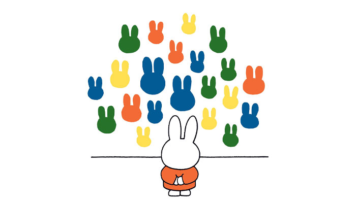
And we take into account our customers where possible. For example, we recently added some Miffy designs of Miffy in an art gallery which have been very well received by our gallery outlets.
Smart. Do you have to think about new occasions these days? What have been some of the changes in card giving that you have seen?
We are always keen to introduce new occasions at the request of our retailers or agents. For example, we now have Baby Shower cards in different ranges, an occasion which wouldn’t have existed 10 years ago.
When immersing ourselves in the available art, we remain open minded about what occasions the images may lend themselves to. We recently added Retirement and New Job cards to our Moomin range as some of the images lent themselves really well to these titles.
Nice! You also develop gift-wrap for some of the brands you work on. Does your design process change much when creating gift-wrap?
We print our wrap on very high-quality paper and always aim to have at least one design of gift-wrap for each card range. Again, our starting point is all about the character, and depending on that we could aim for an end result that is, for example, fun, kitsch, gorgeous, unusual, stylish or sweet.
Consumers want something that makes their gift look amazing. For us, this could be anything from a small repeat to a big and bold single image. We explore lots of ideas… We make mock-ups to see how possible concepts would look when used to wrap a gift to make sure we end up with a great result.
Having worked with lots of brand owners, what makes a good style guide or art archive from your experience? Are there any tips you would give rights owners thinking about developing style guides?
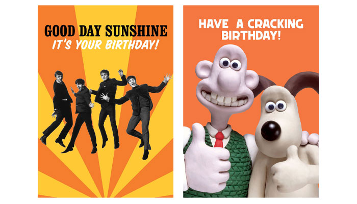
We love licences with a large well-organised art archive and we are fortunate to be working with a number of licences whose original artists were astonishingly prolific. For example, Miffy’s Dick Bruna, Moomin’ Tove Jansson and Peanuts’ Charles Schulz… Or where the licensor is geared towards a constant stream of new artwork, like Aardman, Beano, Hello Kitty or Pusheen.
With regards to style guides, our preference is for plenty of simple images, perhaps with a few birthday-related props like cakes or balloons. And in general, as many images of any sort that can be made available!
If you had to sell licensed cards to a retailer who doesn’t currently stock them, what would you say to them?
This is a frequent occurrence for us as our customer base includes lots of very upmarket shops and galleries. In many cases, we are their first – and continue to be their only – supplier of licenced product. Because of this existing customer base, we are able to give them some examples of brilliant, widely admired shops which do very well with our products. This can help bring about a change in their point of view.
Paula, before we wrap up, what new ranges can we expect to see from Hype in 2023?
We will definitely be launching a Shaun the Sheep range. We’re discussing some other possibilities but haven’t firmed anything up yet. And of course, we will be adding new designs to our established ranges.
And finally, thinking 10 years ahead, are there any brands that are currently popular that you could see joining the Hype family as future classics?
That’s a tricky question to answer! Looking at the properties that are popular now and could become classics… David Walliams stands out in children’s books. And the massive popularity of gaming and platforms such as Fortnite and Roblox means they could become future classics.
Good answer! Thank again Paula.

Lindsay Hampton – Co-President and Founder at Volt Factor – discusses brand plans for creators like TheBurntPeanut, Alan Chikin Chow and That’s Amazing.
“How far we let a partner push it always comes back to that same question: Does the emotional logic hold?” In conversation with Carlos Villagra, Cloudco Entertainment’s Head of Creative.
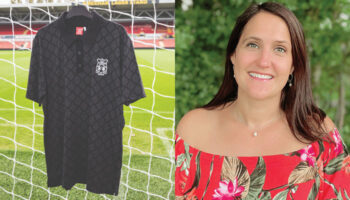
“We see significant growth potential for Wrexham as a football club, a lifestyle brand and content-driven IP”: In conversation with Robyn Cowling, Head of Licensing at Aykroyds.

“We have lots of ideas and ambition, because the scope of this new adventure is huge!”: In conversation with SBC’s Sophie Bloomfield and tonies’ Rodolfo Amaya.
Brands Untapped’s Billy Langsworthy heads to Milan to chat with Tela’s Gabi Drew and Nicol Vircillo about fandom – and why brands can benefit from a focus on human connection.
“Jem is an artist – and what comes with that is touring, residency shows and other theatrical pieces”: In conversation with Matt Proulx, SVP of Global Experiences, Partnerships, and Music at Hasbro.
Receive the Brands Untapped Newsletter

Enter your details to receive Brands Untapped updates & news.