—-
To stay in the loop with the latest features, news and interviews from the creative community around licensing, sign up to our weekly newsletter here

Crush Creative’s Carl Rush discusses The Lord of The Rings: The Rings of Power
Carl, you recently invited me to look at a book you’ve put together… It celebrates 25 years of your company, Crush Creative. You start with a brief summary of how you left London and set up the company… Can you tell us about that?
Sure! It was 1998. In the book, I characterise that as the year Tony Blair was Prime Minister, Nokia phones were all the rage and the Clinton/Lewinsky scandal dominated headlines. In the middle of all that, I made a few life-altering decisions… I got married, left my design job and established my own one-person design agency.
If it’s not too personal a question, Carl, and even if it is – because, let’s face it, people like a bit of dirt – what motivated that? Why set up your own company?
Sadly, it’s not that juicy! My wife – Helen – and I just decided to move out of Shoreditch and down to the coastal city of Brighton just after our daughter was born. Brighton was hardly a go-to hub of creativity back then, and I was very worried that people wouldn’t want to work with me down there!
Yes, weirdly Shoreditch was quite a rough part of London back then – but Brighton was hardly a media hub!
It shows how times have changed over a quarter of a century! Anyway, because of my concerns, I maintained a London address and phone number.
And what were those early years like, Carl? How did you find new work?
Initially, I was just hustling. I relentlessly checked out record companies; I took on any album artwork job that came my way… Cerys Matthew’s band, Catatonia were my first client. Do you know them?
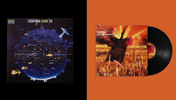
Oh, good god; no… I haven’t heard of anyone after Bobby Darin.
Ha! Well, for the next few years, I steered my way through the ever-changing face of the music industry. I worked on everything from techno compilations to classical violin concerts. Because, back then, the music industry spent a fair amount of money on album covers. A few years later, though, that started to change… Studios had been spending £10k or so on a cover, but that became a dying trend.
So – around 2001, 2002 – album-cover budgets we’re shrinking… And where were you working, Carl? You had an office space in Brighton?
No, not at first. Initially, I was working from a tiny back room. But Helen convinced me to invest in an advertising-agency contact list. It cost £100. That may not seem like a lot now, but at the time it certainly felt like it. I borrowed a month’s mortgage from my mum, and reached out to everyone on that list.
Any joy?!
Yes! Thankfully, a London-based ad agency took an interest. They liked my work. So much so that things were a bit of a blur after that! I soon found myself in Amsterdam pitching to Heineken for a global dance music festival.
That sounds like a pretty big project…
Deej, it was huge! That one contract transformed Crush completely. Overnight, I went from working on my own to being part of a team of four… And we had five years of work lined up!
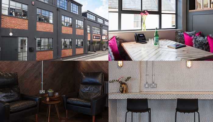
Wow. And how big is your team now, Carl?
There’s ten of us on the team now. I never wanted the company to grow too quickly or much bigger because I still love the hands-on, creative discussions and stay in touch with the real design ideas. It’s like an extended family and the most lovely bunch of folk I could wish to work with.
How else has Crush Creative changed in the last 25 years?
The projects and the brands have got bigger as the years unfold but, to be honest, we’re still very true to our values of 25 years ago. Work hard, play hard, leave on time and above all make beautiful creative work. If you do great work that clients love and are super organised then the rest takes care of itself.
Let’s talk about the book, Carl. Obviously, you’re marking 25 years… What did you aim to do with the book, though?
It’s a huge milestone for any independent company to reach and I wanted to celebrate that by collecting a few project from each year… Projects that either mean something to me – like the beginning of a friendship – or were a significant step in shaping who we are today creatively.
Great answer. And obviously, you’d ideally like people to download the book, or pick up a hard copy… To give us a taste of what it’s all about, though, let’s take a look at something… One thing that caught my eye was your style guide on Lord of the Rings. What was the project?
It was the global marketing style guide for amazon Prime’s show, The Lord of The Rings: The Rings of Power – arguably the biggest TV show ever… Certainly one of the most highly anticipated TV series of all time. It was released in 240 countries and 37 languages.
Quite a lot riding on your efforts, then! What was the brief?
Our mission was to deliver a 2D graphic language! One that would represent realms of Middle-earth for use across marketing, event activations, social media and licensing partners.
And what qualities did this language need to have in order to achieve that?
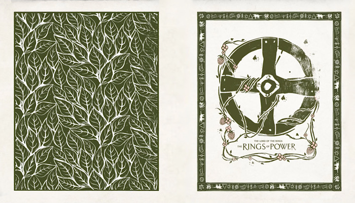
First and foremost, authenticity… At the heart of our creative solution is an authentic, hand-crafted quality. We co-ordinated with the show’s creative team and producers to make sure each asset was meticulously researched.
We wanted to create really subtle, naturalistic and warm iconography… Premium icons, patterns and borders. We wanted to produce graphic lock-ups that brought Tolkien’s world to life like never before.
But how does that happen, Carl? When someone says to you, “We want, rich, authentic iconography to bring Tolkien’s world to life…” What do you actually do? Talk me through your process…
It begins with research – as every project should. My team – some of whom are big Tolkien fans – immersed themselves in Middle Earth. We also had numerous meetings with the show producers and stylists… Only when we really understood their vision for the show did we begin the graphic exploration. The style tests took a month or so before we hit on a look that would work well and be practical for use across all the marketing and licensing opportunities. It was then a case of having our super-talented, in-house illustrators draw up all the assets – with plenty of client check ins along the way.
Fantastic. And once delivered, how was the style guide received?
It was an amazing response! Im pleased to say we saw the creative used globally – in everything from an Instagram post to the full set of the Hollywood premier. It was a huge deal for us and most rewarding for the Crush designers.
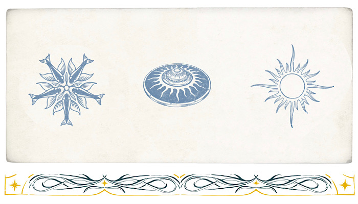
Wow! And it does seem and it does look amazing, I should say. Beautiful design. Let’s start wrapping this up with the penultimate question… What’s the one thing I could’ve asked you today but didn’t?
You could’ve asked me who my heroes are!
Great question! Carl, who – to wrap things up – are your heroes?
Thanks for asking, Deej! My heroes are John Peel and Barry Sheene.
Enter your details to receive Brands Untapped updates & news.