—-
To stay in the loop with the latest features, news and interviews from the creative community around licensing, sign up to our weekly newsletter here

Esselle Retail’s Hannah Pollitt and Carly Laking join the RHS’s Kevin Smith to discuss their partnership.
Welcome one, welcome all… Look at this; it’s a bona fide line-up! So, thank you for joining me: Hannah Pollitt, Product Manager at Esselle Retail Limited; Carly Laking, Design Manager at Esselle Retail Limited… And Kevin Smith, Senior Licensing Development Executive at Royal Horticultural Society – the RHS. Hannah I’m going to start with you! Tell me about Esselle Retail…
Hannah: Thanks for having us, Deej! We have two brands sitting under the Esselle Retail Limited umbrella… Arthouse and Esselle Home. Arthouse started as a wallpaper company nearly 25 years ago and has grown its range to include other categories such as doormats, floor and wall tiles and so on. Esselle Home is a premium brand which launched recently… That introduced a made-to-measure and made-to-order concept for our customers.
But wallpaper is largely what we’re going to talk about today… In terms of partnering with the RHS, why is now the right time for that?
Hannah: We’ve been following the RHS for a long time, and it was always on our radar to hopefully work with them. Then, through supplying flooring to an RHS licensee, we had an organic introduction. With the archives available, and the design capabilities we have in house – led by Carly – it seemed a natural fit! This really was the perfect collaboration for us.
Lovely! And you mentioned the archives… What did you think, Carly, when you saw some of the assets?
Carly: Absolutely stunning! Really beautiful botanical drawings: all kinds of different florals and nature and leaves, which is what we tend to use a lot in our designs. So it was great for us designers to get access to that archive as the starting point for our designs… A really joyful thing to do because all the elements are so beautiful.

Great! Because sometimes I do wonder if having such a tremendous archive means designers are, thinking: ‘Oh good LORD! Where do I start? This is too much!’
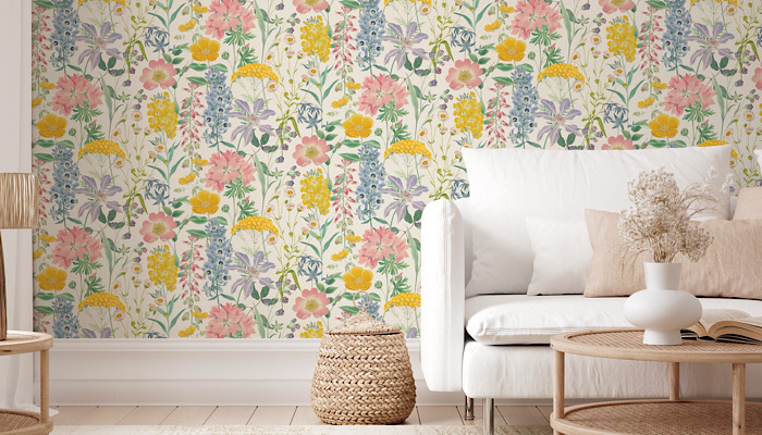
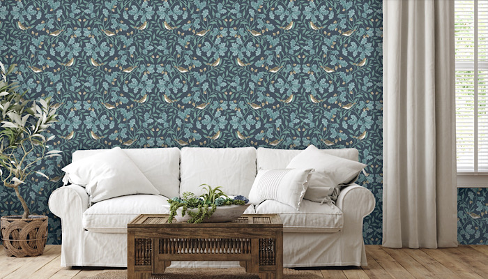
Carly: Ha! No, because the inspiration came quite quickly. We wanted to make sure we put across many of the different styles in what we created. So we made sure there were some more traditional-looking designs; some heritage nature designs with the birds and the acorns… And then we tried to do something that made a bit more of a statement with bold florals and colours. So there was a lot there to let us create something special and give some very different looks and create this capsule collection.
Kevin: From the RHS’s perspective, we have – as you may know – our beautiful Lindley Library in Central London. We’re very fortunate to hold the RHS Lindley Collections; the world’s finest collection of these books: early and modern; historical, artistic and practical… These collections reflect our longstanding passion for gardens and garden plants. And from the many thousands of images we have in the collections, the RHS has created their own style guides, which initially we shared with Esselle to give them a bit of taste of what’s available.
Terrific! Thank you. And from there, Carly, how do you start breaking things down? How do you start categorising ideas?
Carly: Well, it’s great because there was just so much inspiration. We started by categorising things into leaves and flowers and birds and animals to begin with… So there was a bit of initial organisation to help us look through everything. But for the most part, we knew where to go when we were looking to start each design. And quite a few of the team worked on it… We wanted to make sure we got different interpretations of how the elements were used; create lots of different looks. It was a really fun collection to work on.
Fantastic! I can tell you’re all hugely passionate about this creatively; it really comes across in your voices and body language…
Kevin: That’s really a big part of it. We encourage all our licensees to be creative. Thankfully, the guys at Esselle completely embraced the freedom from the outset through to the beautiful creative designs that we can see in this collection. Esselle have taken the style guides and played and been creative and had fun. That really comes through in the finished products, which is very exciting to see.
Perfect. And Kevin, you’ve teed up, very beautifully, my next question… What products are in this initial line?
Kevin: Well, as you know, we’re launching the wallpaper collections at BLE 2024. Then, heading into spring-summer 2025, we’ve got made-to-measure curtains and blinds, and made-to-order cushions. And then there’ll be other things – but we need to be a bit secretive about those, really! That’s a case of wait and see!
And presumably, Kevin, your team had the difficult job of making the final selection? Choosing the first designs to go to launch?
Kevin: Yes, we all met up at the RHS Garden Bridgewater near Manchester a few of weeks ago to go through the collection… It was fun, but it was also a hard job because we had to whittle things down from between 25 and 30 designs to 12… Plus a further 12 for an exclusive collection for AIS; Associated Independent Stores. Of course, Esselle had initially curated what they felt was right… But the beauty is that it was never a case of dropping a design! That’s because we were also lining up our spring-summer and autumn-winter 2025 ranges… Forming the basis of the next collection.
Carly: And from my perspective, we did – of course – have to whittle things down even to show the commercial team here at Esselle. So that was difficult, because I’ve seen what the other designers have worked on… As you probably know, when you’ve been working on something quite intensely, it’s always nice to get fresh eyes to look at it. That can really help. So before we showed the RHS team, we had in-house meetings with Hannah and the commercial team and spoke about what would be right to show RHS.
And presumably you each had a favourite design in the Collection? Carly, I’ll start with you!
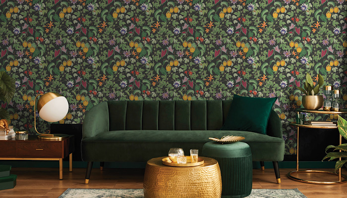
Carly: I do, yes! My favourite is this one with the dark background and big, bold colours – the citrus and vine. Because I personally love the big bold colours; the maximalist aesthetic that this design fits into perfectly. And then you can pick the lovely accent colours out with your accessories – or go more simple with your accessories… Lots of different options. We tried to give customers the option of some softer colourations if they’re not as brave with colour. And then something bolder as well with the dark navy backgrounds and the black and charcoal backgrounds. And that’s something we think about when we’re designing too.
Yes. You’re not designing one product; you’re designing a whole range from which different people can pick to suit their tastes…
Carly: Yes. We’re curating a collection. So once you start whittling down, you have to be sure there’re different looks and different colours. Lighter options, darker options, some softer in design, some simpler styles… And then there’re designs that are a bit fuller; maximalist options like the citrus and vine design I just mentioned.
And obviously, I’ll drop some images in here so that people can see exactly what we’re talking about… People can see your favourites as we go.
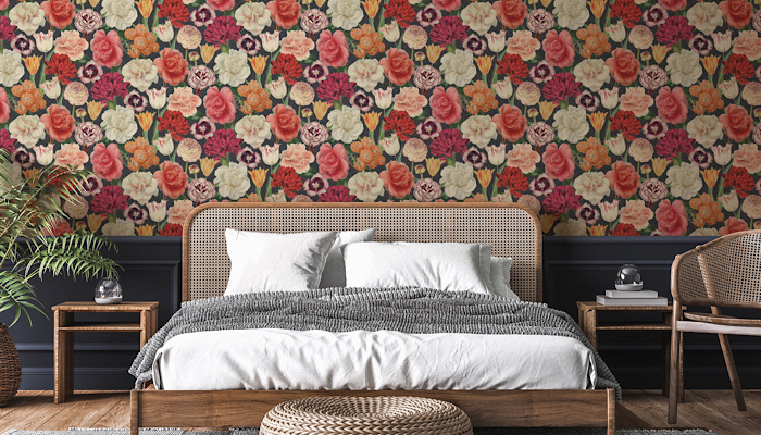
Hannah: Yes, thank you! With this range, it’s a case of making sure there’s something for everyone there. And I think the Blooming Bouquet is my favourite… I like it because it’s so bold and vibrant; with a dark and moody background.
And Kevin, brace yourself! I’m coming to you: same question… Do you have a favourite?
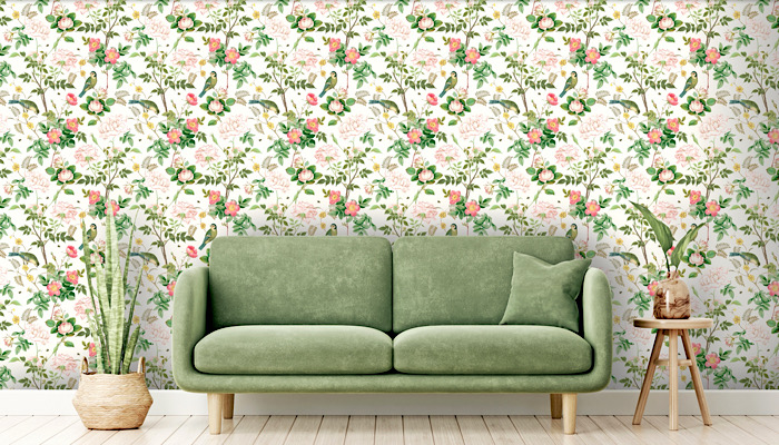
Kevin: I think I’d probably narrow it down to something like Country Garden or the Woodland Birds… They were probably my two favourites. And just adding to what Carly and Hannah have said, the choice is so wide! If you want to go for the bold, then you have that, but you’ve also got the more tonal colours to soften that across the room if you don’t want such a bold print all the way round. So it was exciting to look at that and curate a range to suit everybody’s taste. That’s very important, because it fits in with the overarching mission of the RHS…
Which is what, Kevin?
Kevin: It’s about creating a world where gardening is a way of life. Our mission is to be there for everyone on their lifelong adventure with gardening, making it accessible to everybody. In other words, it’s not just about whether you have an expansive garden, or a postage-stamp garden, an allotment – or even if your balcony is your garden. We also cater to those without a balcony! Even if you have a house plant you are, in our eyes, a gardener – and we want to talk to you. That’s what the team at Esselle has embraced; the need for a range of designs to suit everybody’s needs.
Fantastic! Well, we covered a lot of ground there. I’m going to ask each of you one last question – but there might be some follow up! What’s the one question I could have asked today but didn’t?
Kevin: Well… You asked earlier about what was next – we touched on it slightly but I’ve being a bit secretive… I can expand on it more generally because the home is a key category of expansion for the RHS licensing program. We want to bring the joy of the outside inside. We’re looking to do that through wall coverings, home textiles, table wear, lighting, storage and so on…
Our botanical-inspired artwork lets us bring the beauty of the garden to the home space, creating calming and relaxing living areas. And I think that’s really what we’re looking to do with Esselle and other partners: make that home space a tranquil environment… Because we feel that a garden can have a huge impact on people’s wellbeing. So let’s bring that through and into the home!
Excellent. Thank you, Kevin… Hannah and Carly, same question: what’s the one thing I could’ve asked Esselle today that I didn’t?
Hannah: Probably about much we’ve enjoyed working with the RHS on the collaboration! I think Carly did touch on this, but it’s been such a lovely experience from a design and product perspective. It’s just been great working with them, and it’s gone so well. And we’re really looking forward to the next phase of launches, as well as the different product categories. It’s all really exciting!
Brilliant. And you’re nearly there, aren’t you? It’s nearly BLE! What are the last steps before BLE?
Kevin: Panic!
Ha! I don’t believe that!
Kevin: No, it’s just making sure now that everything fits in the car because of all the props we need to set up. But no, we’ve got the lifestyle catalogue from Esselle – that was signed off last week. So we’re now planning to showcase a few of those illustrations alongside the samples at BLE… It’s trying to create that kind of home-room environment so that people can see how the product might look in a home space. So that’s what we’re working on at the moment. Other than that, I think we’re good!
Fantastic! Well, in that case, I’ll look forward to coming and seeing it on the stand! Thank you, everybody, for making time.
Enter your details to receive Brands Untapped updates & news.